10 'interesting' maps prove the world population is unevenly distributed
The world population is unevenly distributed across territories, in fact it is difficult to believe that it is true. The simple reason for this is because the terrain in many places is not suitable for humans to live.
The world population is unevenly distributed across territories, in fact it is difficult to believe that it is true. The simple reason for this is because the terrain in many places is not suitable for humans to live.
Although our planet earth is large enough to accommodate billions of people, it does not mean providing enough food to feed them. The maps below will show us clearly what we are thinking at the present time is completely different from reality.
To understand more, see the facts about the world's population through 10 " interesting " maps below. They will surprise you!
 © metrocosm
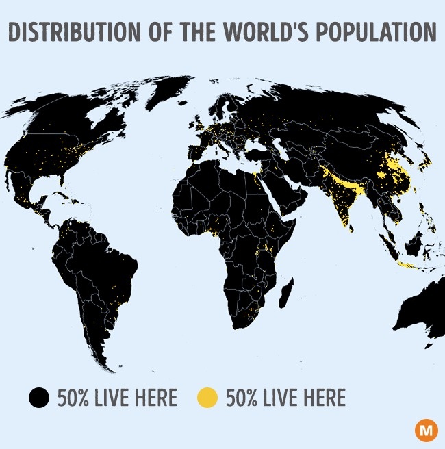
Observe the world map at the top: the area where many people live ( 50% of the world's population ) is illustrated by small, small dots of color combined with 50% of the world's population in illustration in black.
 © metrocosm
Still the world map, but this map is more interesting in that it shows us the most sparsely populated places in the world. It is hard to believe that the blue area has only 5% of the world population. By the number of 5% of the world population, the red dot area is tiny.
 © metrocosm
The map above illustrates Italy 's population density, they are only in 8% of the whole country area. The main reason is because the central part of the peninsula is mainly hills and mountains.
 © metrocosm
Besides, even the population density in Australia has made many people more curious: nearly 11 million people ( half of Australians ) live in the area designated by tiny red.
 © metrocosm
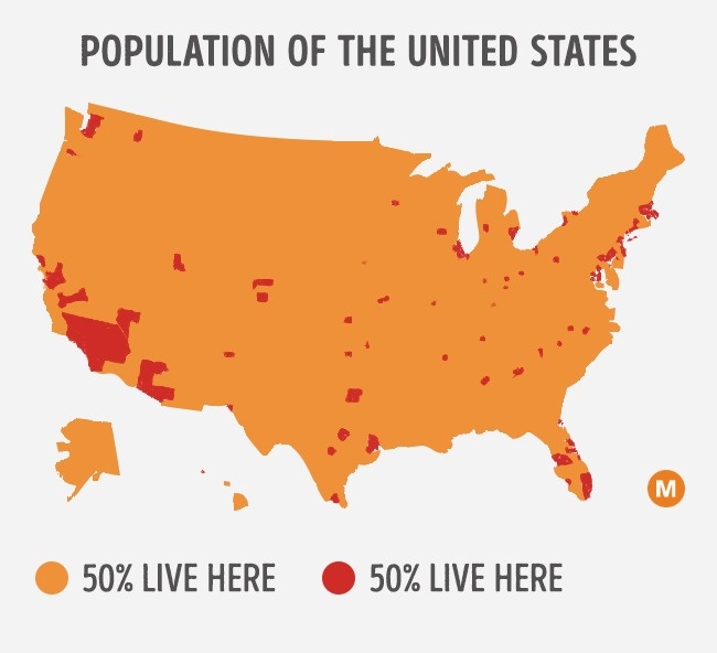
About 50% of the US population is distributed evenly in major cities in the United States. The largest red area is California, the most populous state.
 © metrocosm
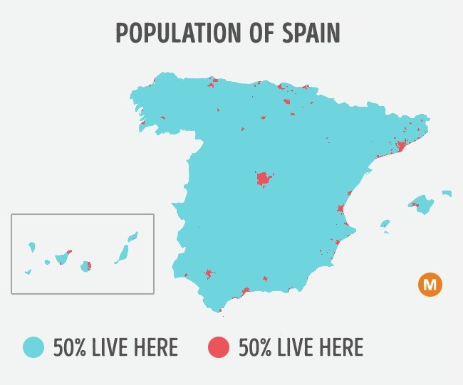
About 90% of the territory of Spain is mountain. That's why people in Spain live in 10% of the remaining area.
 © metrocosm
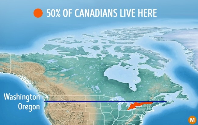
Historically, the border between the United States and Canada lies along latitude 49. Strangely, 50% of the Canadian population lives nearby - the red area, which is roughly the same latitude as Oregon ( one state in the Pacific Northwest of the United States ).
 © metrocosm
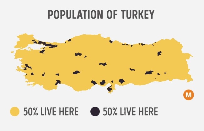
Most of the terrain in Turkey is mountains, only a small percentage of the land is suitable for building high-rise buildings. This explains why the above map shows such density of population living in Turkey.
 © metrocosm
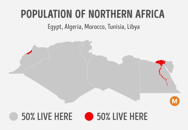
Sahara Desert is one of the harshest places in the world. It almost occupies the entire northern region of Africa. The two areas designated in red represent the two largest cities of the Kingdom of Morocco, namely Casablanca and Rabat, as well as the area along the banks of the Nile River in Egypt.
 © metrocosm
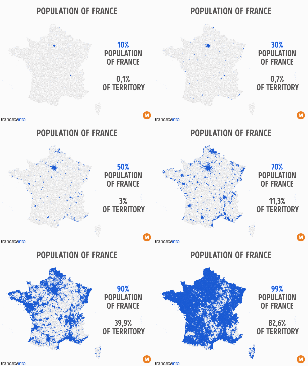
This animation collects from some areas on the map. It illustrates 10%, 20% of the occupied territory, higher than the population of France . France is one of the few countries that has a population living all over the country.
- 1/7 of the world population uses Google Earth
- Delete saved places on Google Maps and Google Now
- 30+ images proving anything in life can happen
- Google Maps helps developers create real-world games
- Google Maps displays the battery life on the device when sharing location
- Play Pac-Man 'lady' version of the game at any place in the world in Google Maps on April this year


