Why do some websites with extremely 'bad' interfaces like Reddit and Wikipedia 'live so long'?
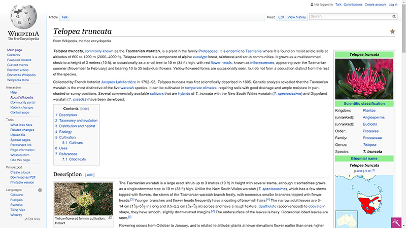
Wikipedia or Reddit both have an unimpressive interface, which is even confusing, but the reality is that millions of people visit here every day and they still survive!
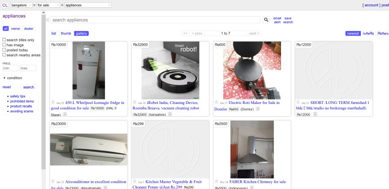
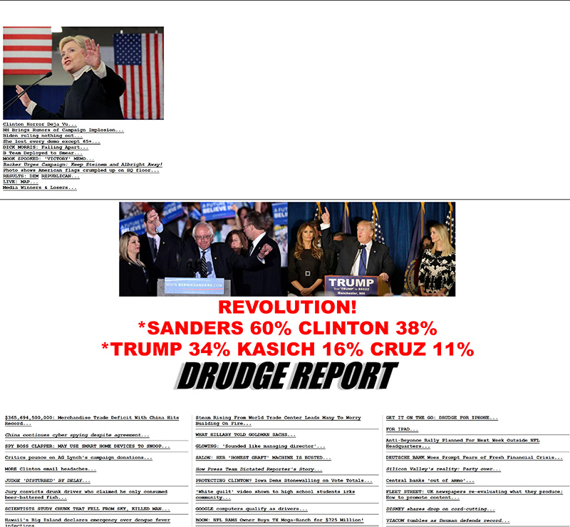
Sure, you have access to websites like Reddit, Craigslist, Wikipedia, 4Chan, Hacker News or The Drudge Report . If you pay attention, you will see that all these websites are different in many things, but they still have two things in common: known to many readers and the interface is, exactly, very bad (in comparison with large numbers). other beautiful web sites).
Technologies that make the web go a lot further than they were a few years ago and now designers also have a variety of techniques and tools to organize the layout of the site at will. However, the above websites still maintain the old layout and have almost no connection with modern web design principles at all.

Why are some websites now different from those built in the 90s? Where are the clear layouts, carefully chosen fonts and complementary colors on those interfaces?
According to many documents, The Drudge Report and Craiglist were actually born 20 years ago - both were released in 1995. Wikipedia turned 15 at about 6 months ago. Reddit , up to now, has been on the market for 10 years and 4chan "anonymous community" has just turned 13.
The problem lies in the fact that it's not easy to just glance at a site that has a good or badly designed interface. You can give a quick, emotional response but a good design is more than just creating a layout that pleases people aesthetically. You also have to consider how convenient the site is and whether it will help visitors find what they need simply.
To better understand this issue, I talked to Amit Das - the co-founder and chief of the data visualization department at Intelligent Interfaces. According to Das:
There is a huge gap in design that we see on sites like Reddit, 4chan . This distance comes from readers' expectations from applications that allow users to create content ( user-generated and applications that integrate a variety of information such as Medium, Facebook or Twitter in comparison with classified content sharing platforms (classified as classified pages) such as Craigslist or forums like Hacker News.
However, let's look at the current status of the above mentioned pages: they still exist after a long and initial period, not built to meet the reader's expectations in 2016. These their developers - their priority towards controlling the traffic traffic that these platforms care about. For example, Reddit is the site with the number of visits ranked 32th in the world while Medium's ranking is only in a certain position in the 300 to 400 range.
Maybe, you always expect new competitors to come up with a better interface and challenge old sites - such as Trulia, to confront Craigslist in real estate. However, one thing to understand is the huge traffic flow for such purchases and sales usually comes from organic search (natural search results in search results pages) and Craigslist. This is only a small part of the widespread popularity of classifieds created by Craigslist worldwide.
What makes a bad interface?
Some of the most common problems of difficult-to-use websites like:
- Lack of clarity: Many fonts and no harmony in using colors will make the site difficult to read, difficult to read, especially with very long posts.
- The navigation bar is misleading: If users can't determine how they can find what they need on your site or can't find links that can lead them there, they're more likely to not stay. Your website is too long.
- Low performance (performance): If you use multiple scripts, images and animations, your page takes a long time to load and may be difficult to access on the user's device.
If you look at the list of errors, you can see that the websites highlighted above seem to have met the requirements of the interface design well (they do not suffer from those errors).

Wikipedia seems confusing and outdated, but the information is clearly readable. Reddit does not seem to be really easy to use for new users for the first time, but this website is very light and has fast loading speeds on most connections.

In 2008, co-founder of Basecamp Jason Fried shared how horribly successful the design of The Drudge Report was, and he also pointed out many interesting points that are still true today: design Its not influenced by time, easy to maintain and compatible with everything. Plus, it is unique!
These are important points to consider because the idea of a sustainable design takes time, repetition, feedback and careful handling. It is not something you can change daily, especially, if you serve a large number of customers who are familiar with its interface and functionality.

Daniel Gackle - who is operating Hacker News (HN) of Y Combiantor explains that there is a reason why the gathering of vote-based links (Link Aggregation) for developers and businesses is outstanding. with such a "rare" interface:
Hacker News puts content all over. An overly impressive interface can leave the site away from this goal. Text is not affected by time.
Hacker News's minimalist interface design is very beneficial to stimulate intellectual curiosity (intellectual curiosity) - curious about things that don't understand and want to master them, suitable for readers who prefer to learn themselves. things that make them feel excited.
Another highlight of the text-based interface design is small pages and very fast loading. Users often care much about this and we even care about it more than they do.
An even greater advantage of classic interface design compared to modernity is that it attracts people who care about the content of the site rather than finding new things.
Occasionally, discomfort is difficult to avoid
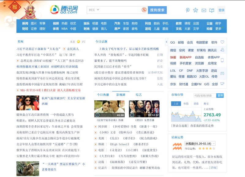
When writing about why Chinese websites are often confusing, Jeff Rajeck from Econsultancy points out that there is not any capitalized or empty letter in Chinese so it is difficult for people who do not know about This language can understand what they should look at.

In addition, Chinese is also very difficult to input and the Internet connection is quite slow. That's why some websites are flooded with links to reduce the number of pages users have to visit if they want to find what they need.
In the case of Reddit and The Drudge Report, the idea of filling pages with links seems to be "a very necessary harm". On the one hand, it does not make the site beautiful but on the other hand, it helps you to browse content faster and maximize the value of time to visit these sites.
However, optimizing the site just to highlight content in the design can "threaten" the first-time visitors - who can't find the best way to take advantage of the new resources they just discovered. Gackle explained:
One disadvantage of Hacker News's design is that it's quite confusing for new people. In the early days, it was very interesting, like a puzzle that needed a solution. However, this feeling doesn't last long because when the site gets bigger, this experience will bring risks. Making the design even more complicated doesn't make things clear, so we won't do it.
Is change always a good thing?
When the site has too many problems it seems the only way is to redesign. However, what is worth noting here is that redesign can confuse users and they tend to "boycott" your site. Digg is an example. Traffic of this website is only about 34% when it is "refurbished" with a completely new interface.
Why is redesign not always the ideal solution?
For sites with large amounts of traffic, a small change in design will also lead to huge impact. This is what companies need special attention. In fact, recently, Reddit has begun testing new designs but the department responsible for this issue also recognizes the importance of developing a highly adaptive interface.
Many people suggest that Reddit can completely "overhaul" the entire interface, meaning complete editing to be different from the old one. However, it is still ideal to take small steps one by one and change each component so as not to affect the other factors as much.
DevianArt - one of the largest communities of art and design in the world has changed the whole interface after a few years of operation, along with the brand is also refreshed. However, product characteristics remain the same. This website is still undergoing gradual conversion and the obvious impacts are very positive.
Meanwhile, Amazon although there is also adjustment but not clear. The changes are so small that even if you visit this site every day, it doesn't necessarily recognize them. However, compared to Amazon's interface 1 year ago, the differences are very clear.
You've just finished reading the article "Why do some websites with extremely 'bad' interfaces like Reddit and Wikipedia 'live so long'?" edited by the TipsMake team. You can save why-do-some-websites-with-extremely-bad-interfaces-like-reddit-and-wikipedia-live-so-long.pdf to your computer here to read later or print it out. We hope this article has provided you with many useful tech tips and tricks. You can search for similar articles on tips and guides. Thank you for reading and for following us regularly.