The exciting story behind the Rio 2016 Olympic logo creation process
The actual Rio 2016 Olympic font and logo is designed by two companies from two different continents. So how can they work together to create such an impressive product?
Table of Contents
The Olympics is a place where many dreams come true, including designers - creators of everything from logos, images on tickets, mascots to medals for each Olympics
In order for all of these jobs to be completed by the time of the event, the Olympic Committee is forced to use outsource services from many different firms. In addition, due to the overlap in the design process, the two firms were unable to work together on a project. The proof is the Rio 2016 logo created by Tátil Design de Ideias - a design company in Brazil, while the exclusive font of the Olympics is built by Dalton Maag - a supplier of typeface in England. erect (now also has a "satellite" office in Brazil). It is this factual situation that suggests a very interesting collaboration study case - two companies of two cultures are forced to work together to create the final product that will be admired by the line. hundred million people in the world.
See more:
- Top 10 "weird" competitions at the Rio 2016 Olympic Games
- Why do Olympic swimmers wear two swim caps?
- History of birth and development of the Olympic Games
![]()
1. Logo
When Tátil Design's creative director Frederico Gelli discovered that there were more than 138 agencies competing to win the logo for the Rio 2016 Olympic logo, the first thought that appeared in his mind was simply to give up. : "I thought it was impossible to win". The Olympic Committee is required to submit a near-complete logo sketch - too hard to do without having any feedback.
However, after a while of thinking, Gelli decided to try. Over the next two months, all of his agency members contributed ideas and eventually, they selected a logo for the best 2016 Olympics."This logo is not designed for designers but for everyone in the world. It represents the power of Brazil and how we welcome you."
According to Gelli, the hardest part of the whole design process is to keep the last idea from being revealed for about four months from the time it was selected until the Olympic Design Committee made an official announcement. Only 10 members of Gelli's company were known, so he and the other 9 colleagues had to create a "fake" project for people to doubt and focus on working. This secret is so hidden that they have placed a wall separating the studio and everyone has to confirm the fingerprint to enter the "top secret" area.
Now that everything has been published, Gelli is ready to share more information behind his project and here are some very interesting things that you might be interested in.
![]()
Mount Brothers (Photo: Rodrigo Soldon)
Inspired
Gelli shared that he had the idea of a 3D logo while swimming in Ipanema Sea."I swim underwater and when I was on the surface, I saw Dois Irmãos (Mount Huynh De). And as mentioned before, because living in the middle of a city famous for sculpture, we needed to create a The logo is harmonious, all the curves of the logo shape are inspired by the mountains of Rio de Janeiro - not only Sugarloaf but also all other mountains. "
In the design process
"This is the original logo. You can see this symbol in caves 1 million years ago and today, they also appear in schools. Using it makes the logo become stronger by because in all cultures, it carries a good meaning - representing unity and power, and, depending on each person, they may feel different meanings. even, the mayor of Rio said that he could see the city of Rio in it, " Gelli said in a funny voice.
![]()
The improvement of the logo
The importance of using 3D Modeling in design
Although Tátil had a 3D concept from the first sketches, the logo was born as a graphical representation because this is still the main expression. However, when the team took the final shape of the logo, Tátil went back to using 3D modeling to see how the logo would look in 3D and whether there were other expressions for the idea."We want people to be able to see the nature of a 3D product in a completely different 2D version," Gelli explains.
![]()
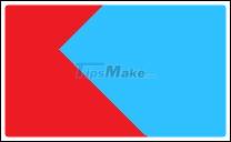
Rio 2016 Olympic logo and Paralympic Rio 2016 logo - both designed by Tátil Design
Color board
Gelli said: "We have a city and a colorful culture. Those colors are connected to the human nature of my country. Green represents Tijuca Forest - one of the The world's largest mountain, blue is the ocean - where the cool and yellow / orange waters are inspired by the warm climate ".
The biggest challenge
After the image of the logo has been completed, the next step is to design a limited set of characters. The typeface is done by another company, so Tatil Design must find ways to ensure that the logo is both charming and visually coordinated with the word "Rio 2016".
"Initially, because the logo was so powerful, we decided to create a neat typeface without having to own many personalities. The logo still played a key role and the word would make it stand out. However, the Olympic Committee asked for the logo to have the same identity as the typeface, so we hired a Typography expert to draw 150 different typefaces on paper to find the one that best fits the logo - curves, logo drawings, logo meaning - before choosing the final product ".
2. Font
About 18 months after Tátil Design's Rio 2016 logo was completed, Dalton Maag received the font design notice. Similarly, the meeting with Maag is also done secretly.
Maag said that the message he received is that the font must be an exact copy of the characters in the logo and this is really a challenge because the creative process has been reversed."Usually, we will create a font, then, a new logo" and Maag only has 3 RIO characters and 4 numbers 2-0-1-6 to create. Below is a picture of the process that Maag and his six team members built them - nearly 500 characters in all (including repeated characters).
![]()
The version of the "n" - is mimicked like the curve of a wave
challenges
"The difference between a logo and font is in a logo, the combination of characters will form a set, and in the font, each character needs to be beautifully designed and matched with other characters" , Maag said. "In logos, some characters are very easy to change like" R "or" 2 "but" 1 "and" o "are the opposite, so finding a balance can be combined in one system. Such harmonious systems are our greatest challenge. "
How did Dalton Maag begin?
"Looks like there are" R "," i "," o "characters and we just need to adjust their size. However, the difficulty here is that it is impossible to use the same characters ( with the same ratio) into the logo because of the lack of connection with the remaining words, so we started using different words - including "passion" and "transformation" (the transition). ) - there are many ligature to see if a letter can be connected and matched with other words ".
Haag continues to share: "Choosing the right words is the key to the success of a concept. Here you have the word" passion "and below you can see a lot of similarities. self in "Rio 2016. After that, we expanded with 23 concepts and started to compare them with another font (font writing" passion "). To the 24th concept, we used the word "transformation" [Transformação] with 3 ligature, including "s", "f", "o" and you can see the combination This is in "1" and "6" in the word Rio 2016 ".
![]()
The font is compared with another font in two words "transformation" (Transformação) and "passion" (Paixao)
Overcome
"Another challenge is to improve the interconnection of letters as if a difference is not good enough. I began to enlarge letters on large sheets of paper, then change the connection between For fonts to look like handwritten and natural, we had to create a lot of alternate characters.There are two versions of the "b," d "characters, "p", "g" and the selected version are based on the preceding and following characters. Thus, the connections become much more elegant. "
The importance of sketching process
"In order to understand what fonts will look like, it is important to understand how they are written. We realize that creating a copy of a logo is not about using a pen to write something but a pattern. For example, the "n" is like a wave.Anywhere on a classic script font, you can easily see the traces to continue editing. and create links between characters.Putting on paper is very important to see how the original logo is written, whether it stands out, "soul" and whether it will create such a connection. Which between the letters ".
![]()
The thickness and curvature of the characters has been considered and revised to make the connection with other letters in the alphabet
![]()
Letters and numbers make up the font of the 2016 Olympics
3. Links
"For this project, we had to be more careful to create the best product to be admired by hundreds of millions of people around the world. However, we have no discrimination and no Realizing that I had to create up to 23 different versions to get the end result, Font is the client's property - the most important asset to affirm their own identity. "
Was this article helpful?
Your feedback helps us improve.
Related Articles
 Top websites to create online logos, beautiful, free online logos 20246 minutes read
 Top 5 simple and professional Logo creation software5 minutes read
 The 5 greatest athletes of the ancient Olympic congress4 minutes read
Reader Comments 0
Sign in with email or Google to join the discussion.