What designers can learn from the amazing UX design of the Candy Crush game
What can designers learn from the UX design of the Candy Crush game?
Table of Contents
Candy Crush is one of the most successful mobile games of all time, and according to many experts, the major contribution to this success is the user experience (UX) designed and optimized. Incredibly awesome of the game. So what can designers learn from Candy Crush's UX design?
Consistency
Consistency in UX design is one of the best ways to help users feel comfortable with your product, reducing confusion and getting used to.
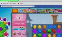
Candy Crush's interface is highly consistent, sticking to the bright, playful tones that can be seen on fonts, sound effects, animations, etc. from one scene to another. suitable for the style and content of the game.
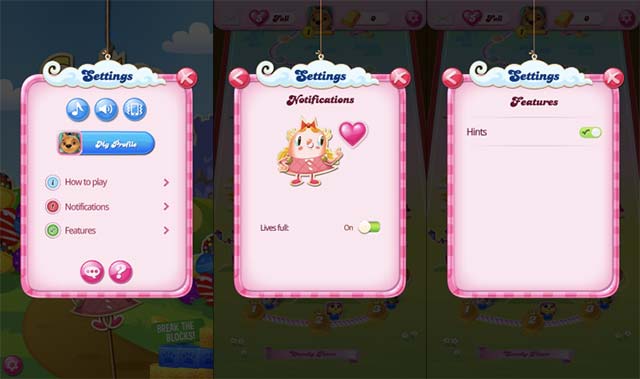
In addition, there are some minor conflicts that can be easily overcome. For example, in the settings menu, they use toggle sliders for suggestion and notification options. These options are also stored in separate submenus, and can easily be integrated into the main settings page.
Effective
Good design will get you to your goals as quickly and easily as possible. The menu system of Candy Crush is very simple, but still guaranteed to give players the full range of options they want.
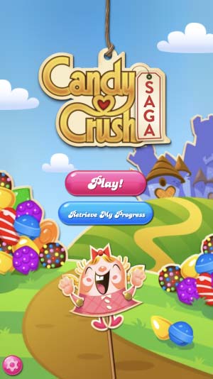
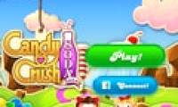
Accessing the game for the first time, you will see a colorful introduction screen, the title of the game and only 3 optional buttons. If you want to play, just click the Play button in the middle, if you want to exit or install the system, you just need to click the gear icon in the lower left corner of the screen - very simple but effective.
However, there are still some disadvantages to talk about. For example, in the inventory interface, players have to click on a locked booster to see the criteria needed to unlock it, while completely possible to be integrated into the design to always be available. The same situation appears with the level introduction screen. You must press to find the criteria that should have been displayed. This is not difficult to identify and get to know, but for those who are fastidious, there will certainly be dissatisfaction.
Attention to details
One of the best ways to make a digital experience impressive is to surprise users. Candy Crush does this well by borrowing ideas from different design styles and making its own modifications, with the emphasis being on emphasizing the smallest details, giving players the surprise. about the care of the game design team.
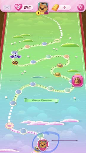
For example, when you accidentally scroll too far on the level map, an icon will appear that will take you back to the current level position. You can play it in both landscape and portrait mode, a feature that most mobile games don't have. There are also a lot of elements in the game that are adjusted based on the orientation that makes the player feel more comfortable.
summary
Here are some notes that designers can refer to perfect the digital interface design for their products:
- Prioritize choosing a clear and readable font in your design, especially in the header. For a good experience, users first need to easily read and understand the content that you share on the interface.
- Do not put too many things together. For example, for the options menu, when you combine too many options in the options, the user will feel confused and 'stuffy'. Head to the balance by using the extra menus and displaying only the necessary information on a given screen. The organization chart and structure of the interface must be consistent with the nature and purpose of the product.
- Important information must be clearly visible and easily accessible. If you can't create a button or icon that clearly describes the function, be cautious and use things like descriptions, animations, or sounds to help users easily understand the meaning.
- Learn from many other areas to optimize the user interface. Another approach is to experiment early and often with diverse user groups and even those who may not be potential customers for your product.
Was this article helpful?
Your feedback helps us improve.
Related Articles
 Candy Crush Saga officially docked in Windows Phone1 minutes read
 Candy Crush Saga will be available on Windows Phone?1 minutes read
 Top 5 good Android games like Candy Crush Saga in 20215 minutes read
 Download Legend of Solgard, the latest game from the manufacturer of Candy Crush2 minutes read
 How to Play Candy Crush Saga without running out of lives5 minutes read
 Play Candy Crush Saga on your computer using BlueStacks3 minutes read
Reader Comments 0
Sign in with email or Google to join the discussion.