This is the biggest problem of iPhone X
As a phone, iPhone X can be considered a breakthrough with new features and appearance. But running the application on it is another story.
As a phone, iPhone X can be considered a breakthrough with new features and appearance. But running the application on it is another story.
Since the size and shape of the screen change a lot compared to previous iPhones, you'll have a little trouble with some applications when displayed on this screen. Many applications have not been updated for the new screen, so it will look a bit weird.
See also: iPhone X screen: Size and special features
App developers still don't know how to use the virtual Home bar that iPhone X uses instead of the physical Home button and the slot on the top of the screen, where the front camera is located and the sensor to detect the face.
Currently, many applications have not been changed to suit the new screen of the iPhone X, and this is a big disadvantage of this phone. It takes time for developers to redesign the application to suit iPhone X.
This is an image of some popular applications that show how on iPhone X, along with what is and is not.
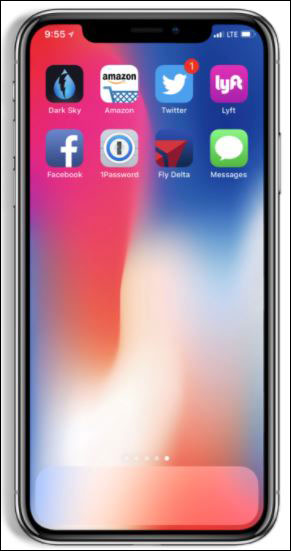
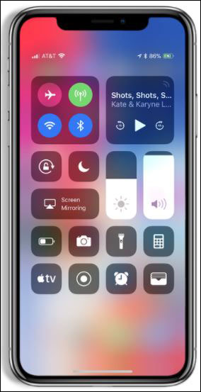
Home and Notification screen of iPhone X

On the Amazon application, there is no navigation bar below, so the Home bar has jumped to the top of the page.

With Twitter, the content is full in the screen and the space above is very nice.
The icon below is taken by the Home bar, so it is very narrow.
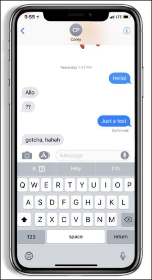
Like many other Apple apps, there is plenty of space underneath the keyboard of the Messages application.
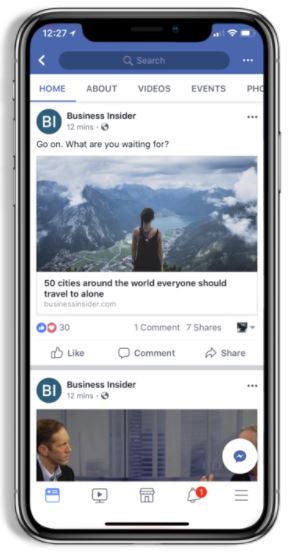
Like many other apps, Facebook's navigation icon also has to make room for Home, so there's plenty of space.
- What to do when the iPhone or iPad can't turn on?
- 6 ways to fix iPhone can't turn on Bluetooth
- Look for a satisfactory explanation for the iPhone 6 Plus bending error
- Apple uses a combination package that convinces users to pay $ 1000 for iPhone 8
- iPhone X is a product exclusively for the younger generation - those who like selfie
- 5G iPhone should be ready by fall despite coronavirus, Foxconn reportedly says


 How to test the screen, check the iPhone screen easiest
  How to fix black screen error on League of Legends
  8 ways to take screenshots of MacBook Air M1 2020
  How to share a video call screen on Viber
  How to display a full screen PowerPoint presentation
  How to prevent students from drawing on Zoom