Table of Contents
This guide provides a clear overview of new font, including the main concepts, practical steps, and common questions. Use it to understand the topic, compare the available options, and make a more informed decision.
Specifically, the new Aptos font is now available for testing by Microsoft 365 Insiders on Windows, macOS, Android, and coming soon to iOS. Before introducing Aptos, Microsoft asked customers to vote for a new font to replace the old Calibri. The five new variants include Bierstadt, Grandview, Seaford, Skeena and Tenorite.
The Office user community picked up Bierstadt, Microsoft later renamed the font Aptos, and it's now ready for testing in the Microsoft 365 Insider program.
Aptos is a Sans-serif* font developed by Microsoft based on inspiration from Swiss typefaces of the mid-20th century. The font was created by top designer Steve Matteson and released in 2021. The company decided to apply this font on a large scale after many trials and received good feedback.
Aptos comes in a variety of customization options: Light, Even, Semi-Bold, Bold, Extra-Bold, and Black, with all six variants supporting italics. While Office applications now use Aptos by default, customers can still access Calibri in the font selection menu as usual.
Microsoft's latest internal update not only introduces a new font, but also comes with a host of other aesthetic changes. Typically new default styles with improved readability, navigation, and a "more professional" look.
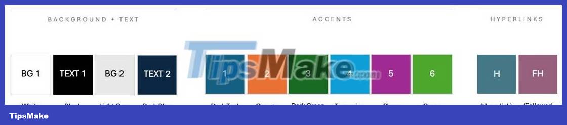
There's also a new set of default colors for backgrounds, accents, and hyperlinks. Microsoft says it has studied popular color palettes and design trends to create a set of colors that work consistently and look good in all Office applications, and help users create more accessible content.
Microsoft has also redesigned the default border to increase consistency, as well as provide better contrast.
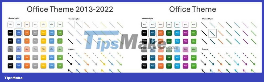
Finally, Microsoft emphasizes that users have full control over the image, and that they can revert to the previous Office theme (2013-2022), set Calibri or another font as the default, or use the Word 2013 scheme to format documents.
The update is currently available to Microsoft 365 Insiders on Windows (version 2308, build 16701.20000), macOS (version 16.76, build 23070400, and Android (version 16.0.16701.20000).
Conclusion
Understanding New Font makes it easier to compare options, avoid common mistakes, and apply the information in this guide more effectively. Review the relevant requirements before making changes or choosing a solution.
FAQ
What is New Font?
Specifically, the new Aptos font is now available for testing by Microsoft 365 Insiders on Windows, macOS, Android, and coming soon to iOS.
Why is New Font important?
Understanding New Font helps you evaluate features, compatibility, performance, and potential limitations before you choose a product or follow a procedure.
What should you consider when using or choosing New Font?
Consider your specific goal, compatibility requirements, available features, cost, security, and the practical recommendations described in this guide.
Related Articles
 Instructions for Setting the Default Font in Microsoft Word4 minutes read
 How to Change the Default Font in Libreoffice3 minutes read
 Change the Default Font in Microsoft Word 2010: Tutorial2 minutes read
 Steps to Restore the Default Font in Microsoft Office3 minutes read
 How to Change the Default Font for Mail Application on Windows 104 minutes read
 Instructions on How to Change the Default Font in PowerPoint4 minutes read
Reader Comments 0
Sign in with email or Google to join the discussion.