Design website running on multiple devices (responsive web design) in HTML
Responsive Web Design just uses HTML and CSS to automatically resize, hide, minimize, enlarge a website.
Table of Contents
Responsive Web Design - What is a responsive web design?
Responsive Web Design just uses HTML and CSS to automatically resize, hide, minimize, enlarge a website to make it look better on any device (desktop, tablet, phone). A website should look nice and fit on every device.
Set viewport
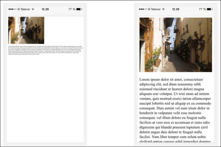
When designing websites that respond well to many devices, add elements .
This will create a viewport for the page, instructing the browser how to control the size on the page. This is an example of a website that does not use a meta viewport (left) and a website that uses a meta viewport (right).
Images have high feedback
Responsive image or responsive image are images that resize to fit the browser size. There are several ways to create images with this ability.
Use width characteristics
If the CSS width property is set to 100%, the image will shrink and enlarge.
Note that the image may be magnified more than the original size, so use the max-width. feature above all else max-width.
Use the max-width property
If you use the max-width and set 100% properties, the image will also shrink when needed but never zoom in to the original size.
Images vary according to the width of the browser
Death in HTML allows to use different images with different browser window sizes.
Text size is highly responsive
Text size can be set in units of 'vw', meaning 'viewport width' (viewport width). Then the text size will display according to the browser window size.
Viewport is the size of the browser window. 1vw = 1% viewport width. If the viewport is 50cm wide, 1vw is 0.5cm.
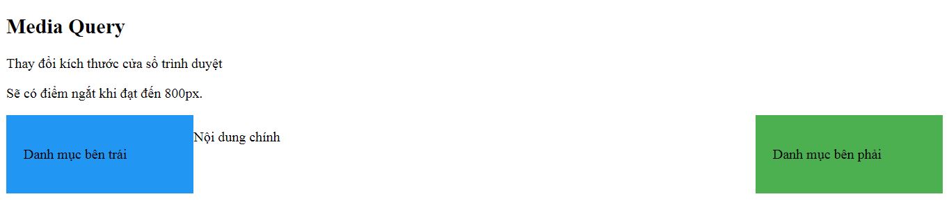
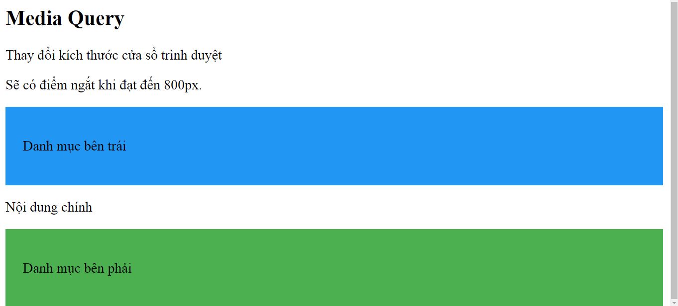
Media Query
Besides changing the size of text and images, the use of Media Query to display websites on multiple devices is also very popular because they help define different ways of displaying on different browser sizes.
Media Query
Resize browser window
There will be breakpoints when reaching 800px.
List on the left
main content
List on the right
High-responsive websites look normal on computer screens but will be smaller when viewed on mobile devices. There are many CSS frameworks that make it easy to apply this to your site like w3.css or Bootstrap. Bootstrap uses HTML, CSS and jQuery to bring visibility into multiple devices for the page.
This is an example of a website that uses Bootstrap to display on multiple devices.
Was this article helpful?
Your feedback helps us improve.
Related Articles
 Hacks for Building a Mobile-First Responsive Website7 minutes read
 How to convert any website into a Figma design6 minutes read
 Tips to help you create responsive layouts easily4 minutes read
 TOP best AI tools for website design9 minutes read
 6 leading website design companies in Vietnam8 minutes read
 5 steps to learn a dynamic HTML web component profile9 minutes read
Reader Comments 0
Sign in with email or Google to join the discussion.