Table of Contents
A bubble chart plots two numeric values on the horizontal and vertical axes, then uses each bubble's area to represent a third value. In CanvasJS, every point is an object with x, y, and z properties: x and y set the position, while z controls the bubble size.
Use this chart when all three measurements are meaningful and readers need to compare patterns rather than read exact values. For a single size value or a simple ranking, a bar or scatter chart is usually clearer.
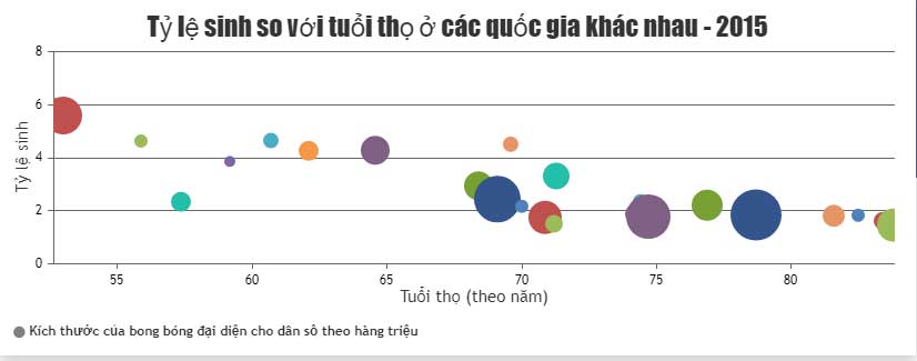
Complete CanvasJS bubble-chart example
Save the following code as bubble-chart.html, then open it in a web browser. The sample loads CanvasJS from its official CDN, creates a chart container, supplies four data points, and calls render().
<!doctype html>
<html lang="en">
<head>
  <meta charset="utf-8">
  <meta name="viewport" content="width=device-width, initial-scale=1">
  <title>Project bubble chart</title>
  <script src="https://cdn.canvasjs.com/canvasjs.min.js"></script>
</head>
<body>
  <div
    id="chartContainer"
    role="img"
    aria-label="Bubble chart comparing project cost, duration, and team size"
    style="height: 420px; width: 100%;">
  </div>
  <script>
    window.addEventListener("DOMContentLoaded", function () {
      const chart = new CanvasJS.Chart("chartContainer", {
        animationEnabled: true,
        theme: "light2",
        title: {
          text: "Project Cost, Duration, and Team Size"
        },
        axisX: {
          title: "Duration (weeks)",
          minimum: 0
        },
        axisY: {
          title: "Cost (thousand USD)",
          includeZero: true
        },
        data: [{
          type: "bubble",
          name: "Projects",
          showInLegend: true,
          legendText: "Bubble area represents team size",
          markerColor: "#2878b5",
          markerBorderColor: "#164a70",
          markerBorderThickness: 1,
          fillOpacity: 0.75,
          toolTipContent:
            "<b>{name}</b><br>" +
            "Duration: {x} weeks<br>" +
            "Cost: ${y}k<br>" +
            "Team: {z} people",
          dataPoints: [
            { x: 4,  y: 18, z: 3, name: "Website refresh" },
            { x: 7,  y: 31, z: 5, name: "Mobile prototype" },
            { x: 10, y: 52, z: 8, name: "Data migration" },
            { x: 14, y: 68, z: 6, name: "CRM rollout" }
          ]
        }]
      });
      chart.render();
    });
  </script>
</body>
</html>
The page requires an internet connection because it loads the library from a CDN. For an offline or production deployment, use the installation method allowed by CanvasJS and review the library's current license and hosting instructions.
How the data points work
| Property | Controls | Example |
|---|---|---|
x | Horizontal position | Project duration in weeks |
y | Vertical position | Project cost in thousands of dollars |
z | Bubble area | Number of people on the team |
name | Label available to the tooltip | Project name |
CanvasJS documents that z is proportional to the bubble's area, not its diameter or radius. That distinction matters: if the third value doubles, the visual area should double. Scaling the diameter directly would exaggerate the difference.
Useful customization options
markerTypechanges the symbol to a circle, square, triangle, cross, or another supported marker.markerColorsets the fill color for a series or an individual point.markerBorderColorandmarkerBorderThicknessimprove separation when bubbles overlap.fillOpacitymakes overlapping bubbles easier to see.toolTipContentcontrols the details shown on hover.zValueFormatStringformats the third value when it appears in a tooltip or label.
The official CanvasJS bubble-chart reference lists the current supported properties and combinations.
Use different colors for categories
Create a separate data series for each category when color has a real meaning. For example, one series could represent internal projects and another client projects. Give each series a label and use colors with sufficient contrast; do not rely on color alone to communicate the category.
data: [
  {
    type: "bubble",
    name: "Internal",
    showInLegend: true,
    markerColor: "#2878b5",
    dataPoints: [
      { x: 4, y: 18, z: 3, name: "Website refresh" }
    ]
  },
  {
    type: "bubble",
    name: "Client",
    showInLegend: true,
    markerColor: "#e07a2d",
    dataPoints: [
      { x: 10, y: 52, z: 8, name: "Data migration" }
    ]
  }
]
Common mistakes to avoid
- Using negative or meaningless size values: bubble area needs a sensible non-negative measure.
- Mixing units: all
zvalues in one comparison should represent the same unit. - Too many points: heavy overlap makes size and position difficult to read. Filter, group, or add interaction.
- No scale explanation: state in the legend or subtitle what the bubble area represents.
- Missing exact values: add tooltips or a supporting table for readers who need precise data.
- Decorative third dimensions: do not add bubble size when it has no analytical meaning.
Accessibility and responsive layout
A canvas-based chart is not automatically understandable to screen-reader users. Add a clear accessible label and provide the underlying values in a table when the data is important. The container's percentage width makes it responsive, but the chart may need to be rendered again after a major layout change in a custom application.
If a bubble chart still obscures the main comparison, switch to a scatter plot or small multiples. You can also review TipsMake's overview of data-visualization tools before choosing a chart format.
Related Articles
 Javascript Code to Generate Dynamic Line Graphs/Charts2 minutes read
 Javascript Code to Generate Box and Whisker Charts/Graphs2 minutes read
 Javascript Code to Create Bubble Chart with Custom Marker2 minutes read
 JavaScript Code to Create a Combined Area and Line Chart3 minutes read
 Javascript Code to Create Multi-Series Graphs That Update Live Data2 minutes read
 Javascript Code to Create Dynamic Charts/Graphs2 minutes read
Reader Comments 0
Sign in with email or Google to join the discussion.