Table of Contents
This practical guide explains how to Present Survey Results in Powerpoint or Google Slides through clear, ordered steps. It also covers useful settings, common mistakes, and checks that can improve the final result.
You have the survey results in hand but don't know how to present them in PowerPoint or Google Slides? Don't worry, this article will guide you On how to present a survey in Microsoft PowerPoint, Google Slides .
Graphs & Charts
When it comes to presenting numerical data to your audience, one of the best ways is to use charts. A good chart conveys the most relevant features of your survey, while also allowing you to make comparisons, highlight trends, or display other relevant elements.
You should use various colors in the chart, representing each value or result of the survey, this will make the topic clear and transparent.
The following are various types of charts and graphs you can use to present your survey data. Just choose the one that's right for you.
Bar Chart
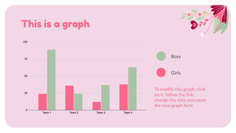
These are a safe choice because they are easy to create and interpret. All values can with minimal effort be compared to each other.
Line Chart

This type of chart is great for illustrating how various factors change over time or a certain distance.
Venn Diagram
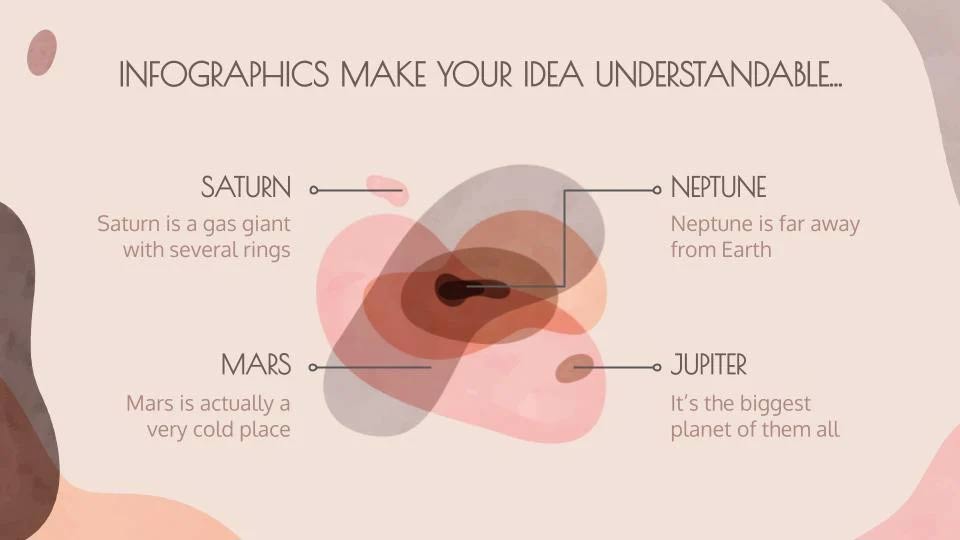
A Venn diagram (named after its creator, John Venn) is an information graphic that shows groups of one or more elements delimited by closed lines so that the elements of each group remain inside.
In the image you can see the Venn diagram in an abstract style, without fixed lines, in case you want to give your result a more casual touch!
Pie Chart
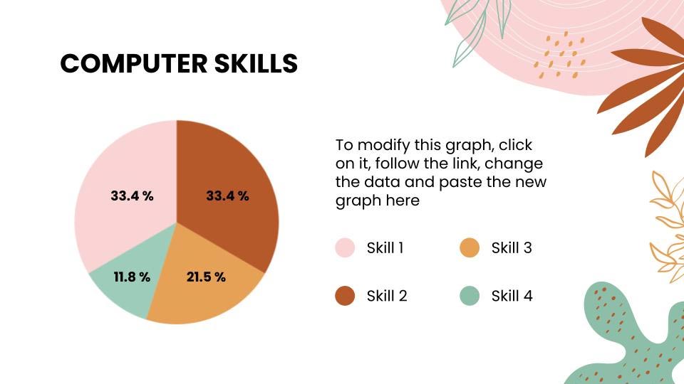
This type of chart is very popular and is used to compare various parts that form a circle. You should use various colors for each data according to the topic.
Information Graph
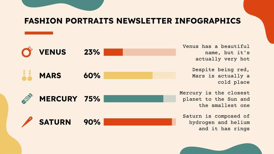
Infographics are perfect for discussing surveys. They are eye-catching and organize information in a way that makes sense. Infographics make data more appealing and easier to understand. They are a great addition to your presentations.
Other Survey Results Presentation Tips
- In addition to the numerical data, present the survey's objectives and conclusions. Your audience will appreciate it if you involve them in the process of interpreting the survey.
- Explain how you collected the information. Detail your survey process so your audience can see the effort involved.
- Talk about the various variables in your survey. Age, location of the survey, and other variables are part of various surveys.
- Use a moderate number of charts or infographics. Balance is key, so include only data that is relevant to the development of the survey and leave out variables or sections that are irrelevant.
FAQ
How do I Present Survey Results in Powerpoint or Google Slides?
Follow the steps in this guide in order, verify each setting before continuing, and check the result after every major change.
What should I prepare before I Present Survey Results in Powerpoint or Google Slides?
Confirm compatibility, install current updates, save important work, and back up data before changing system or application settings.
What can I do if present Survey Results in Powerpoint or Google Slides does not work?
Review permissions and requirements, restart the relevant device or app, repeat the steps carefully, and use official support resources when the issue continues.
Related Articles
 How to Convert Google Slides to Powerpoint3 minutes read
 Why People Use Google Slides More Than PowerPoint7 minutes read
 How to Convert PowerPoint Files to Google Slides5 minutes read
 How to Repeat Powerpoint Slides Automatically3 minutes read
 Free Download of Beautiful Powerpoint and Google Slides Slides2 minutes read
 How to Open PowerPoint Slides on Google Slides4 minutes read
Reader Comments 0
Sign in with email or Google to join the discussion.