Google is testing a series of major changes on the Google.com search homepage
The Google homepage (Google.com) is one of the most familiar websites on the internet. You visit and are greeted by an interface that couldn't be simpler: the keyword search box and the Google logo.
However, this may soon change as Google seems to be planning to apply a series of changes and additions to make the Google.com interface less boring and more useful.
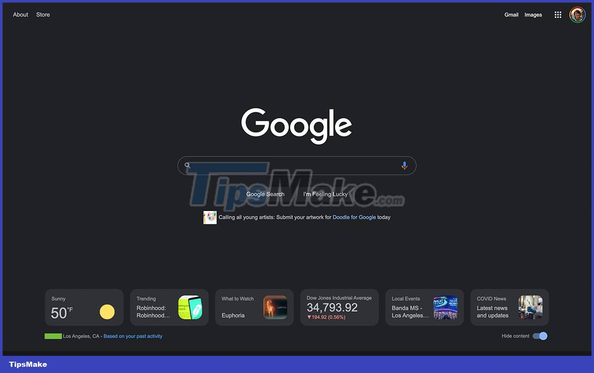
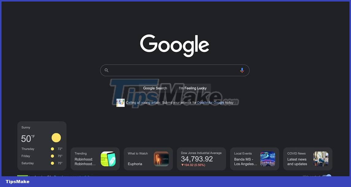
The difference seems to be showing up on the PC version of the Google.com homepage. There are widgets and quick access cards at the bottom of the screen, providing some essential news on a variety of topics. Of course, the search box and familiar Google logo will still appear in the middle of the screen.


These widgets and access tokens appear at the bottom of the google.com interface. There will be a switch that allows "hide content" in the lower right corner. Google will also show a note related to the zip code/city you live in, and explain that the suggested information is "Based on your past browsing activity". When the window is fully expanded, up to six tabs are displayed, and all of them automatically expand when you hover your mouse over:
- Weather: Weather status icons + current temperature, and forecast for the next 3 days.
- Trends: Internet search trends
- What to watch: Entertainment shows and movies
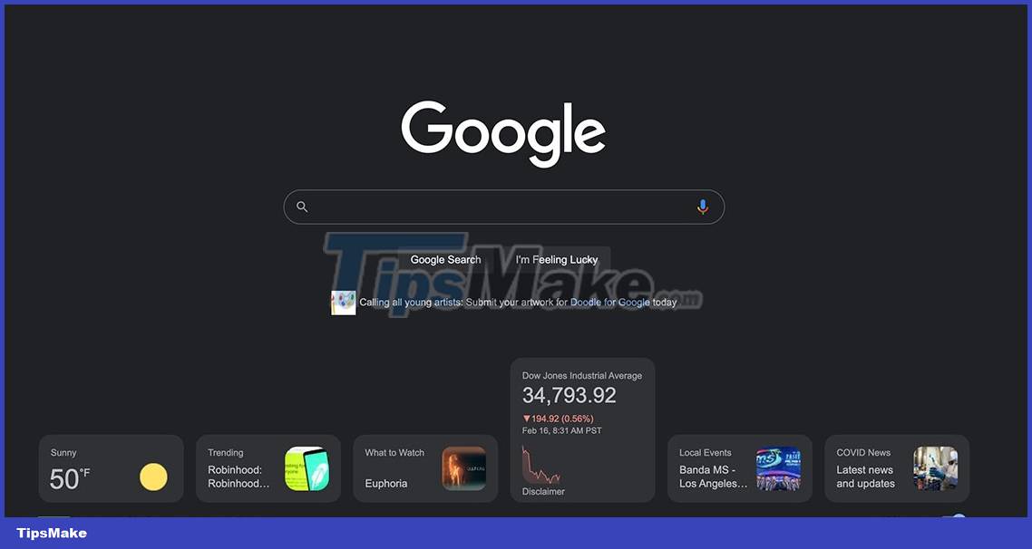
- Stocks/markets: Market volatility chart
- Local events: News, events related to your area
- News about COVID-19
Tapping on each card opens all relevant web results. The number of cards that appear depends on the size of your screen, there is no way to scroll and view more cards without expanding the window.
Overall, the appearance of these widget tags should provide users with more utility without disturbing the overall experience. Weather is of course the most useful addition, and it's also a nice alternative to Chrome's increasingly busy New Tab page.
This test is probably being rolled out internally with a certain audience, as most users will still only see the standard search box when visiting Google.com, absolutely nothing else. . Google hasn't officially announced anything yet, but everything will probably be perfected and rolled out over time.
- How to make Google your homepage on Firefox
- How to set Google as the browser homepage
- How to Set Google As Your Homepage on Mac
- Google announced a major change in search functionality
- How to reset the homepage for Google Chrome browser
- How to remove the original Yahoo Toolbar and search. yahoo. com?


 How to change dots into commas on Google Sheets
  3 simple ways to download pronunciation files on Google Translate
  How to download videos Google Drive blocked download
  Fix GameLoop error without Google Installer
  How to fix Google Sheets not allowing scrolling
  How to use Google Drive like free FTP server or Network Drive