Color inspiration secrets only designers know
This article will list color-inspired tips, shared by top designers from the Creative Market community, so you can get the perfect color combination every time.
Color is an essential element of good design. With so much psychology and emotion attached to the shades you choose, choosing a color palette when designing can be daunting. Here are some color-inspired tips shared by top designers from the Creative Market community so you can get the perfect color combination every time.

Capture inspiration on the go
When looking for color combination inspiration, Callie Hegstrom, the talented designer behind Make Media, suggests taking photos of beautiful colors: ' I take photos of beautiful color palettes (like flowers or sunsets) and then sample those colors directly in Photoshop or Illustrator. This is also a great way to incorporate text or graphics into whatever photo you're working with to ensure there's cohesion in the piece .'
So if you see a photo with a color scheme you love, sample the colors directly from that photo to create a quick, easy, and effective color scheme. Tools like Photocopa make this technique even easier. Just upload your photo, explore the different shades that make up the photo, and build a beautiful color scheme in no time.
Using the color wheel
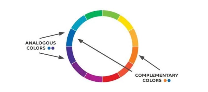
Artist Marc Chagall came up with a great quote to remember the factors that work when it comes to color combinations: 'All colors are friends to their neighbors and lovers to their rivals.' In this case, 'friends' are analogous colors: those that lie next to each other on the 12-part color wheel. On the other hand, Chagall called complementary colors 'lovers'; those tones that are directly opposite each other on the wheel.

This tip works for almost anything you can think of. Try analogous color palettes to add shadows to your headlines or borders to your backgrounds. These colors often work well together because they are closely related. Find unique combinations simply by mixing colors with neighboring colors on the wheel!
Inspired by interior design
Different design fields share similar challenges when it comes to color. For example, interior designers must harmonize spaces by using textures, objects, and color palettes that work well together.
On this point, British designer Elena Genova (from MyCreativeLand) offers some important advice. ' I like the rule for interior design because it also works quite well for graphic design: 60% – dominant color, 30% – secondary color, 10% – accent color. If you want to introduce a fourth color, keep the secondary color separate (or it can be the dominant color but never the accent color) .'
Try looking into other creative fields and discover their common rules when it comes to using color – every art form has a few! If you keep an eye out for rooms and buildings that use color well, you'll be able to tap into a whole new world of great color techniques.
Create a color mood board
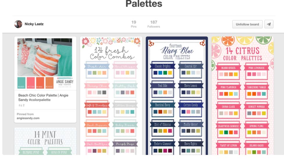
Nicky Laatz, owner of a design and typography shop, shares how she stores beautiful color palettes for later use:
' Whenever I see a picture or photo that has a color I like or that really seems to work, I'll take a screenshot or pin it for later. Then, when it's time to find a color scheme that works, I'll look to all my saved images for inspiration and I always find something that works. '

Allow yourself to look for color palette inspiration anywhere—in contemporary designs or historical art; in online or print sources.
You probably already know about the usefulness of sites like Pinterest, which allow you to save and catalog all sorts of digital color palettes. But what about physical sources of inspiration?
Designer and author of the book 'Steal Like An Artist', Austin Kleon, is a big proponent of the 'swipe file'—a notebook or folder where you can stick inspirational examples of your favorite designs and colors. So if you're reading a magazine, holding an interesting flyer., stick it in the file. Then, when you're trying to develop a nice color palette, dig out the swipe folder and take a look. Instant color inspiration!
Use color swatches
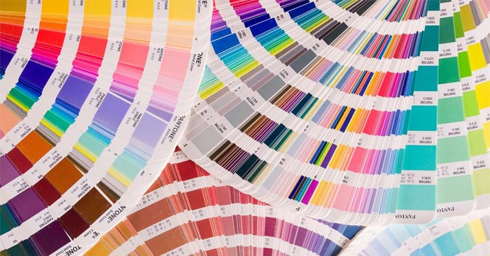
Sometimes when choosing a color combination, a digital color wheel just isn't enough. It's great to step outside the box and look at real-world color swatches instead, which is exactly what the Pantone set offers.
Designer Callie Hegstrom uses her trusty Pantone Color Bridge kit whenever she wants to pick a color the old-fashioned way. 'Sometimes it's nice to have a real-world guide that doesn't just rely on the colors on screen,' she explains. 'It's also helpful if a client has a specific color need and wants to see actual samples.'
What's great about Pantone swatches? Every Pantone color has its HEX equivalent. You can even use hexadecimal colors in the Canva color picker to quickly and easily develop color palettes.
Pantone swatches & other physical color indexes are also great for any designer creating something for print. Knowing exactly how your colors will look on paper can save you a lot of time, money, and stress when it comes time to print.


 How to Draw a Circle in Gimp
  How to play Among Us in color blind mode
  Create Button in CSS
  How to add color coded terminal code to Microsoft Word
  How to create and use custom gradients in Google Slides
  How to change the Facebook background color