8 things to note when doing Infographic
Infographic is a powerful solution for connecting information because it helps data sets and visual images - the left brain and right brain - thus making it easier for users to comprehend and memorize and share more information.
Data is appearing everywhere on the Internet. However, this also makes it difficult for us to understand and memorize all of them if we only read pure text.
However, when putting them into a story, data will be much more connected. According to calculations, the human brain can process images 60,000 times faster than reading words and for this reason, infographic is becoming a content design trend that many marketers pay attention to.
Learning how to create and use charts and infographic will allow you to:
- Increase guest conversion rate (Lead conversion rate) and interaction rate (Engagement).
- Increase customer retention rate (Retention Rate).
- Increasing the impact of visual elements on the overall brand experience (Brand experience).
- Increase brand recognition (Brand recognition).
- Optimize the brand experience in creating positive connections for users.
- Increasing the influence of brand identity system (Brand identity) on purchasing decisions.
Here are 8 things to and should not do when doing the infographic that you should pay attention to.
1. SHOULD: Simple and focused
Shorten your message into a sentence: concise, understandable, powerful, capable of influencing. From here, you can use the data to reinforce what you are trying to convey. However, keep in mind: "Less is more" (the less there is, the more).
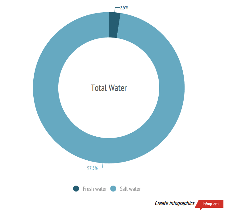
The chart above is simple but contains "a big story". Thanks to the use of contrasting colors, readers immediately understand how scarce the water is. This is an approach that you should keep in mind if you want readers to focus on a specific information.
2. DO NOT: Put too many things into a chart
Bad, poor, and "disorganized" data will make your product unattractive to many users.
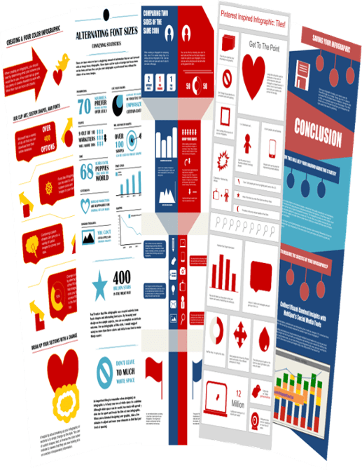
In order to create more effective charts, marketers should focus on the items that will help you emphasize the message. Also, don't forget to organize data neatly, cleanly, user-friendly rather than confusing like the infographic.
3. SHOULD: Surprise the reader
Do you have any anticipated information that will create interest for readers? If so, use it as a way to make them unable to ignore your infographic.
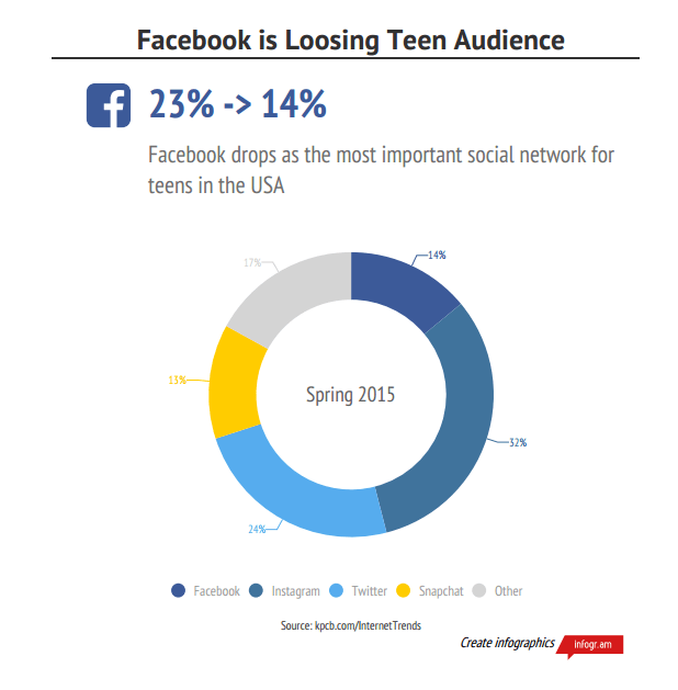
If you can make readers doubt their inherent beliefs, be open to new ideas and then, fill them with information and you'll find it easier to attract readers' attention. so many, so much.
4. DON'T: Use titles too boring, and "say" everything in the first bridge
In the image below, pepper doesn't create a connection. Moreover, the message that it is showing most people know (Facebook is the most popular social network). So, why do readers have to read all of your infographic?
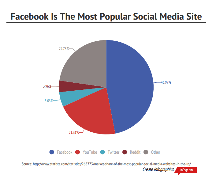
Create goals that will entice, "lure" users to lead them to discover more new and more valuable information.
5. SHOULD: Exploiting visual metaphors (visual metaphor)
Detailed, specific, data-based debates will certainly convince readers to be faster and more efficient, while also stimulating them to remember, identify and share your products.
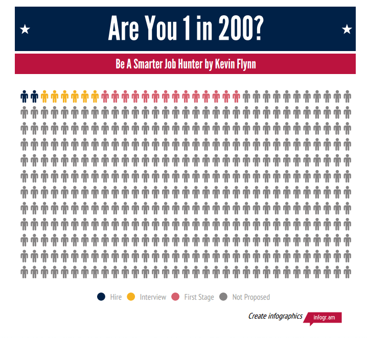
The above infographic visualizes a "job hunting" process in a very clear way: 200 people apply for a job together, 7 get the first step, 3 get the interview opportunity and finally, only 1 person selected. Thanks to the use of human icons and color codes, this infographic becomes very unique.
6. DO NOT: use cryptic formats to visualize data
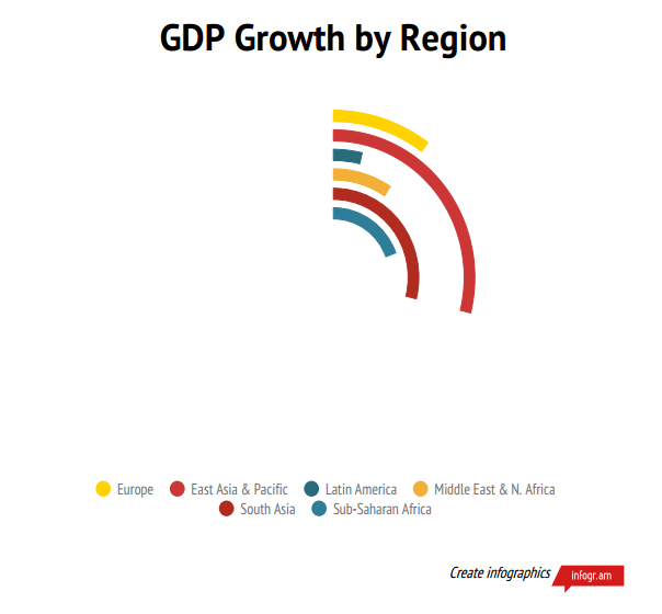
Be careful with the "strange" data visualization types, rarely used or confusing to users.
7. SHOULD: Create trust for your message
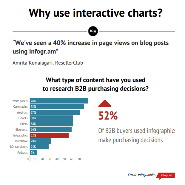
You can use quotes, customer feedback, expert assertions, certifications or reliable data to increase user confidence.
8. SHOULD NOT: Present data without context (context)
As mentioned above, good stories need to convey emotions. In fact, it doesn't matter if your message makes readers' emotions rise, as long as you make them feel something.
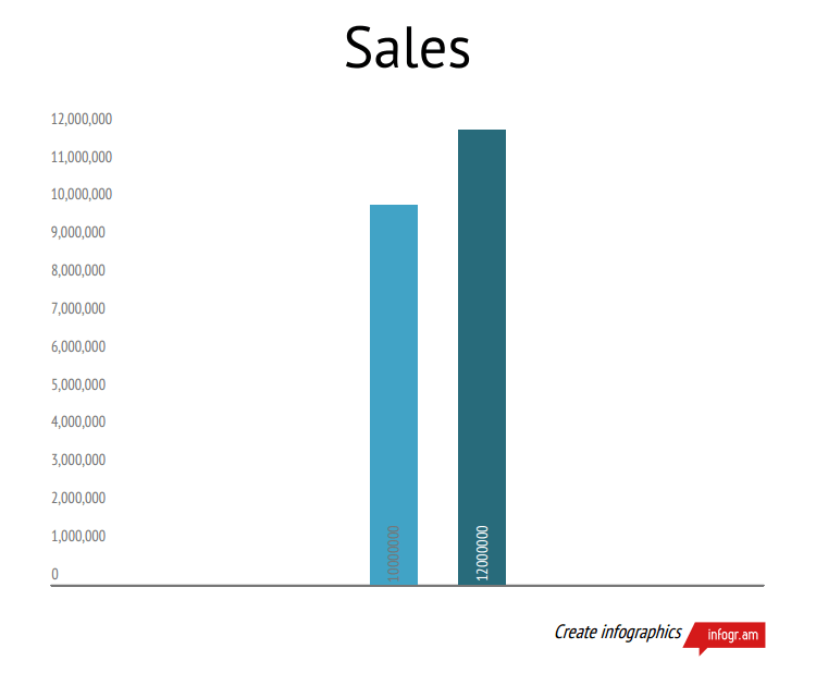
In the chart above, designers completely fail because they present sales figures without a specific context, making it impossible for readers to understand whether the trend is negative or positive.
- 5 Infographics tricks for beginners to Marketing
- 11 free tools that support creating simple infographic
- [Infographic] Things to know about a hacker
- How to create professional Infographic by Piktochart
- 10 dangerous things we often do with smartphones
- [Infographic] How does IIoT impact key industries?


 How to display Internet speed in the status bar of Samsung phone
  How to align an Excel page so that when it fits on A4 page
  How to remove periods in numbers in Excel
  How to fix: The table in Word is overflowing
  How to use TeraCopy to speed up file copying
  How to Quickly Make a Table for WordPad