Viewport simulation with Device Metrics on Chrome
When building or modeling a responsive website, you need to check the site in multiple viewport sizes to check if the layout and pages are displayed well.
Table of Contents
When building or modeling a responsive web page, you need to check the site in multiple viewport sizes (the view - the part that the user will see the content of the web page displayed) to check it layout and pages are displayed well. There are several ways to do this, such as using Adobe Edge Inspect or browser extensions like Dimensions for Chrome .
The problem is that these tools do not always work smoothly in all cases.Adobe Edge Inspect requires that laptops and mobile devices be connected to the same wireless network. XIP.io also requires devices to connect to the Internet and in many people's experience, it is difficult to debug responsive websites according to iframes or to resize the browser window multiple times.
Simulation of viewport size with Device Metrics
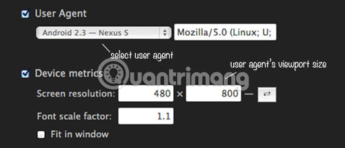
Google Chrome recently introduced a new integration feature, which can fix all the issues mentioned above. This new feature is called Device Metrics . To activate Device Metrics, open the Developer Tools Setting .

Go to the Override control panel . Select Device metrics and you can specify the size for viewport.

The result will be displayed immediately.

You can swap the length with width and height by clicking the button next to the input fields.

If you are unsure of the screen resolution used, you can also change the browser User Agent . And the fields that enter the screen size will be filled in with the actual viewport size from the selected User Agent .
For example, selecting " Android 2.3 - Nexus S " will set the size to 480 x 800pixel, selecting " iPad - iOS5 " will set it to 1024 x 728pixel.
You can find a full list of mobile device viewport sizes in Screensiz.es.
Google Chrome has many useful features to streamline the development process. Now, by using Device Metrics, you can debug the site to have a specific viewport size without having to deal with a restricted connection, use a third-party browser extension or search. iframe.
Hope you are succesful.
Was this article helpful?
Your feedback helps us improve.
Related Articles
 How to disable Google Chrome's AI features on your computer.3 minutes read
 6 Interesting Metrics You Didn't Know Your Apple Watch Was Tracking5 minutes read
 How do I create a 3D simulation experiment using Gemini?3 minutes read
 How to use the Send Tab to Self feature on Chrome5 minutes read
 Google extended the life of the Chrome OS device by 1 year2 minutes read
 Top 10 best realistic car driving simulation games of 20249 minutes read
Reader Comments 0
Sign in with email or Google to join the discussion.