Things Google needs to change since Honeycomb 3.0
There are many attractions of Honeycomb, but there are still a few things that are uncomfortable for users. Here are the changes that Google needs to make to make its next tablet OS version a star.
There are many attractions of Honeycomb, but there are still a few things that are uncomfortable for users. Here are the changes that Google needs to make to make its next tablet OS version a star.
Improve image display quality
Images viewed in the Gallery app appear blurry and disappointing on Motorola Xoom. Finally, the problem of displaying unclear, accurate images on most Honeycomb devices. After a few weeks of publication, it was Google's spokesman who admitted the problem but said that he did not give any information about the above error correction.

The outstanding issue when viewing images displayed on Honeycomb tablet compared to Apple iPad 2, even Samsung Galaxy Tab 7-inch based on Android 2.2. On Honeycomb, Motorolam T-Mobile G-Slate tablet, Acer Iconia A500 and Asus Eee Pad Transformer TF101 found that they lacked sharpness and detail. These factors are considered important in the display, Honeycomb's color temperature and white balance have been greatly restricted.
Compared to Gingerbread, the interface works better but dark is what users are disappointed at Honeycomb.
Better keyboard
Honeycomb keyboards need to be improved more than Android 2.x, they include an attractive QWERTY keyboard design. Although equipped with extended blue effects when typing content like what an Apple iPhone keyboard owns, users need a more extended blue effect. Users can hardly see the blue light because it is covered by your finger on the key.

Tweak the interface
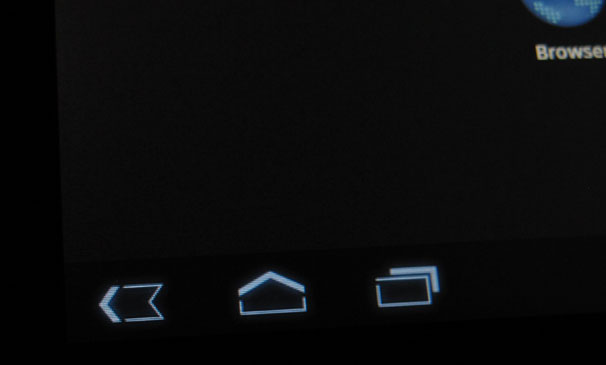
The navigation buttons are located on the bottom left of each Honeycomb screen. In the design, only a few buttons actually work with its functionality.
From the beginning, the ' Exit ' button was a problem. This button looks like a horizontal mark, but many people feel like the back button. This button acts as a back button for users to move back to the preview screen, but only for some applications. Meanwhile, the recent access button on the right is clearly not a function of the product and is not easy to see as a prominent content tracing button.

Currently, some manufacturers like Asus have made a few changes to these buttons on their products. But if it is determined that it is a problem, Google will definitely need to solve its main problem.
Remove Root folder
Compared to other mobile operating systems, Android allows users to easily access their files within the application. This capability is the key to the ability to interact with other computers and applications, allowing the tablet to have maximum flexibility in what products can do. This means that users can transfer files to the table via email, application, memory card or even a direct connection to the computer. Users can then use an application on the device to do something with the above data. It is definitely a user attraction.
Take practical examples: During the use of Asus Eee Pad Transformer TF101, users attach a USB flash, open Word docx file. In Office Polaris 3.0 software pre-installed on the tablet, users can edit the document and then save it under a new name directly to their folder on the USB flash drive or to the tablet.
Some file management applications allow users to access the Android file system but by default, files / folders are organized as a mess. Users must be a developer who knows where to store files and what is in the directory. For example on the Transformer tablet, the management of files shows the folders on the USB drive hidden inside the root folders.
Improved handling of external storage
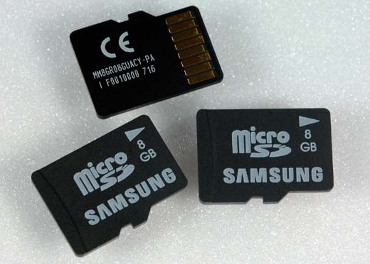
Honeycomb tablet is at least equipped with a microSD card slot to expand storage capacity. And some have USB ports, directly integrated into the tablet or integrated into a station that connects to the tablet. That's a lot of external storage options.

Unfortunately, Honeycomb has a problem with external storage. To start, every time a card or device is inserted, the Android operating system needs to maintain a constant connection. When compared to Microsoft's Windows, this is a disappointment, the Windows operating system requires lighter but faster work. Theoretically, Android can only show itself when working with flash storage devices. This may be considered the 'Achilles heel ' of this operating system, Google needs to proceed to fix the problem if you want to go further.
- How to change the language on Google
- The Google home page on mobile has changed, no longer just a search engine, but also many other interesting things
- Instructions for changing Google DNS 8.8.8.8 8.8.4.4
- 10 handy Google tricks
- The best, fastest DNS list of Google, VNPT, FPT, Viettel, Singapore
- How to change Google DNS for the router


 How to change the display name of guest users in Microsoft Teams
  Turn your Android device into a webcam for Windows 10
  Android emulator online right in the browser
  Fivetown Explained: CS: GO's Newest Steam Scam
  Instructions for configuring DNS Service Discovery
  Issues related to the KB4579311 update