The new widget feature of iOS 14 is very similar to Android
This is the biggest UI change since the iOS operating system was launched.
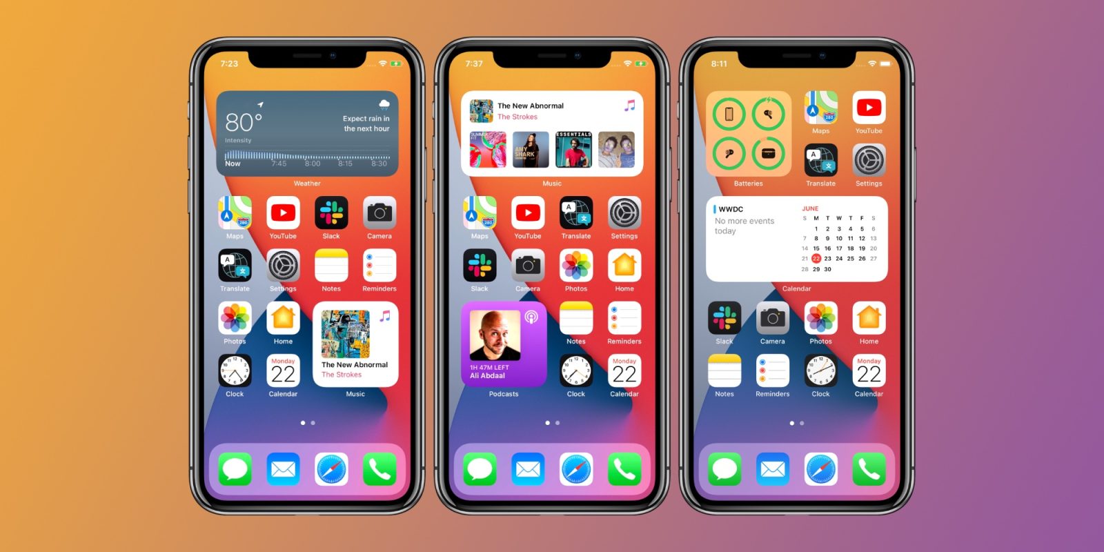
One of the biggest changes of iOS 14 is the completely new home screen interface. The biggest UI change since the launch of iOS. And one of them is the permission to integrate widgets into the home screen interface, a feature that is very similar to the Android operating system.

Gone are the days when iOS's home screen interface was limited to square app icons and folders. iOS 14 offers widgets that can be resized and positioned as you like.
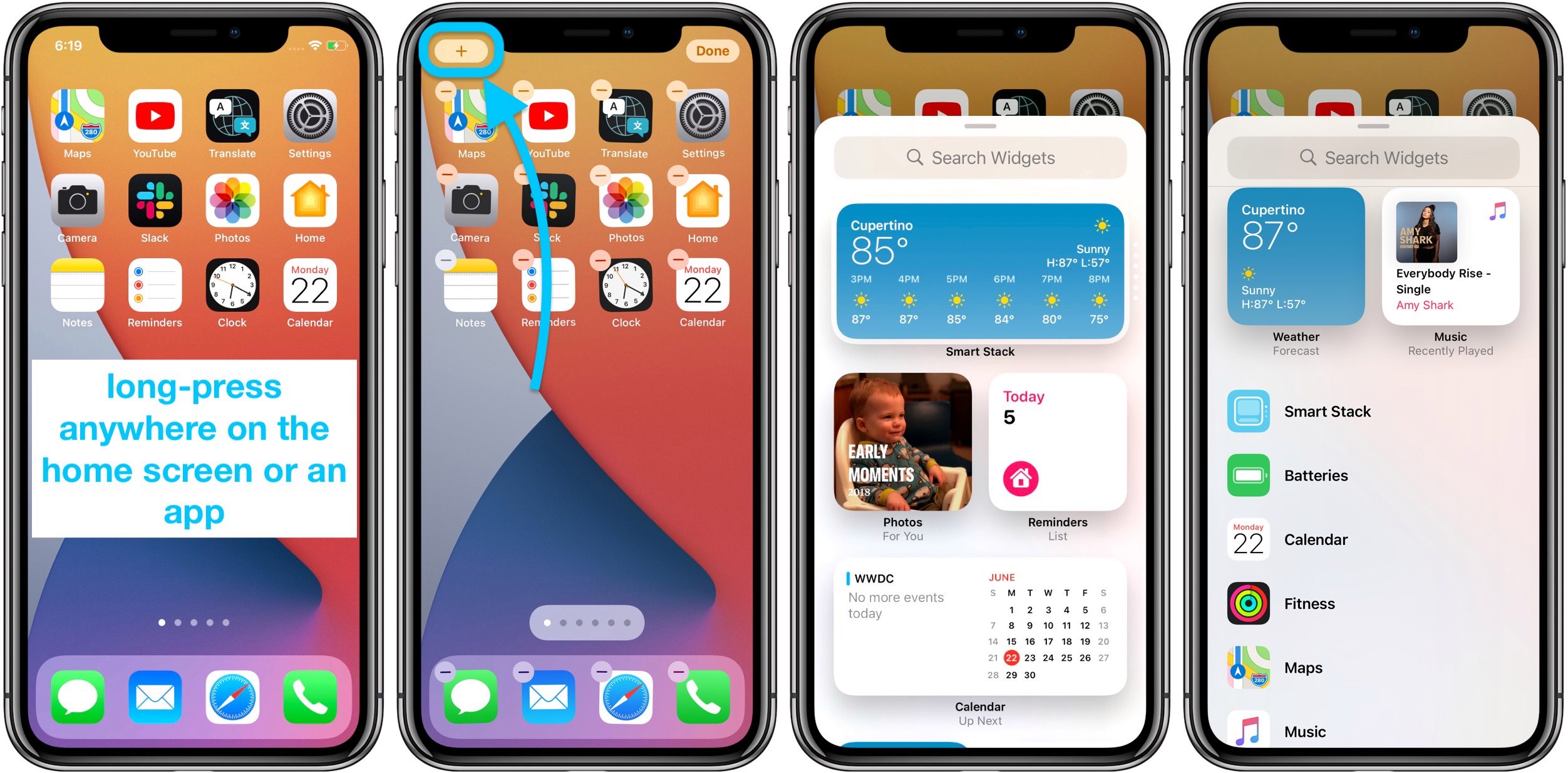
To be able to add widgets to the home screen interface, users simply press and hold on any empty space on the screen. Until the application icons start shaking and a custom interface appears.

In the top left corner, you will see a plus sign. Clicking will bring up widgets that you can add to the home screen.

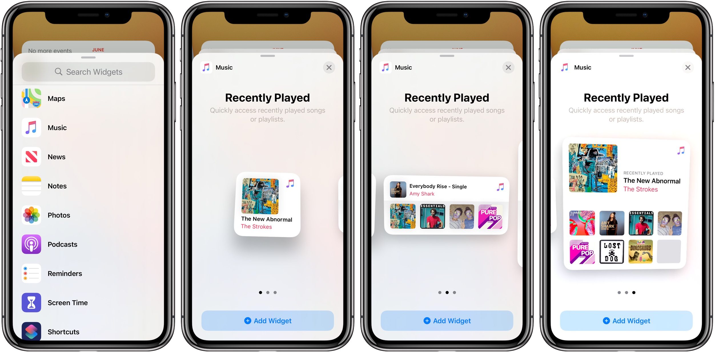
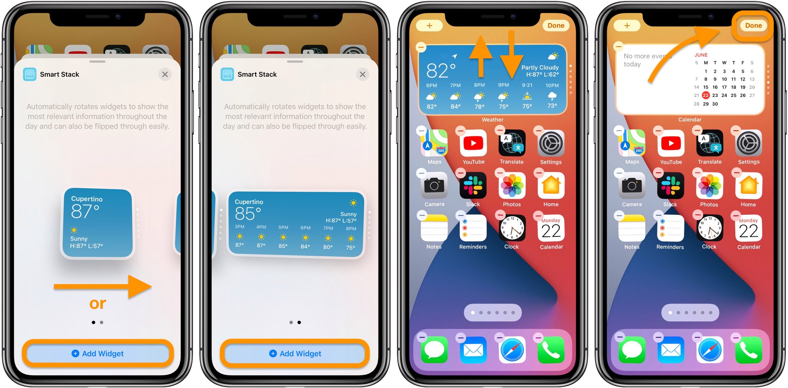
After selecting a widget of your choice, be it a music driver or weather forecast, you can choose the size of the widget. Finally, click on Add Widget to add that widget to the home screen.

You can also drag and drop widgets to change position, similar to how to change the position of an application icon. Click the Done button in the top right corner to finish.
Third-party developers are also developing new widgets, making iOS 14 more attractive and useful.
Discover more
ios 14 widget apple iphone androidShare by
David PacYou should read it
- How to prevent Widget Stacks automatically changing on iPhone
- How to use ChatGPT widget on Android
- Instructions to change the detailed battery capacity widget on iOS 14
- How to add 2018 World Cup schedule to widget widget for iOS, Android
- How to install the Bing Chat AI utility on your phone
- The Quiet Details That Make a Sports Betting Platform Feel Reliable
- Instructions on creating toy set images with ChatGPT AI
- How are AI agents changing the journalism industry?
- iOS 14 has overcome one of the most annoying issues on iPhone
- Already have iOS 14 and iPadOS 14 Developer beta 1, please update the experience first
- Apple Pencil and iPadOS 14 will turn your handwriting into a typewriter