Table of Contents
Zawa, formerly X-Design, is an AI-assisted design platform for creating a brand identity and applying it to marketing assets. Its current tools cover logos, color and typography systems, brand guides, posters, menus, packaging mockups, product images, social posts, and related visual material.
Zawa can accelerate concept exploration, especially for a small business without an in-house designer. It cannot guarantee that a logo is legally available, technically suitable for every format, or strategically distinctive. Treat generated work as a draft system that needs review and refinement.
What Zawa AI does
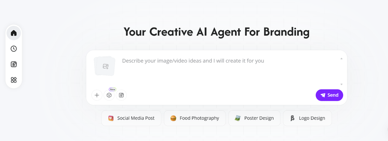
Zawa asks for information about a business and uses it to generate related visual directions. The platform's brand-memory feature stores approved assets and applies them to later designs. According to the official Zawa site, current outputs include logos, brand guides, visual mockups, posters, social content, product photography, and editable branded layouts.
The platform is best understood as a connected design workspace rather than a guarantee of complete branding. A brand also includes positioning, promises, customer experience, naming, voice, and operational behavior—areas that a set of visual files does not settle.
Prepare a clear brand brief
Before generating, write a concise brief that makes real choices. Vague adjectives such as “modern,” “premium,” and “unique” are used by many businesses and rarely define a useful direction.
- Business: What do you sell, and where or how is it sold?
- Audience: Who is the primary customer, and what matters to them?
- Positioning: What should the business be known for compared with alternatives?
- Personality: Choose three specific traits and describe what each means visually.
- Constraints: Required name, existing colors, languages, symbols to avoid, and regulatory needs.
- Applications: List the first five places the identity must work, such as a storefront, app icon, menu, package, and social avatar.
- Competitors: Identify visual conventions worth following and clichés that would make the brand blend in.
Create three visual identity directions for a neighborhood bakery named [name].

Audience: commuters and families who value fresh, unfussy food.
Positioning: dependable daily baking with seasonal local ingredients.
Personality: warm, practical, quietly playful.
Required applications: storefront sign, paper bag, square social avatar, menu, and one-color stamp.
Avoid: wheat-stalk clichés, script fonts that are hard to read, gradients, and visual similarity to [competitors].
For each direction, explain the concept, color logic, type direction, and how it works in one color and at small size.
Generate and review logo directions
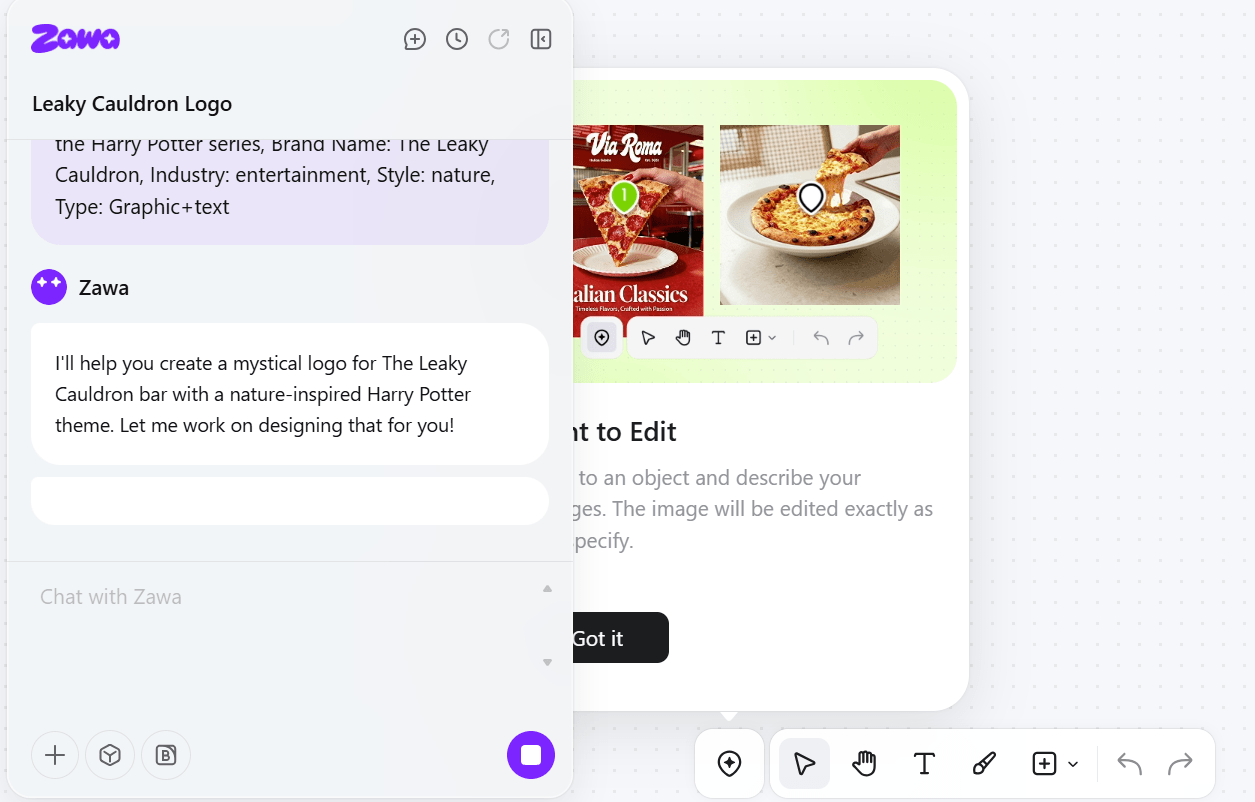
Ask for several genuinely different concepts rather than color variations of one symbol. Compare them against the brief before choosing the most attractive image.
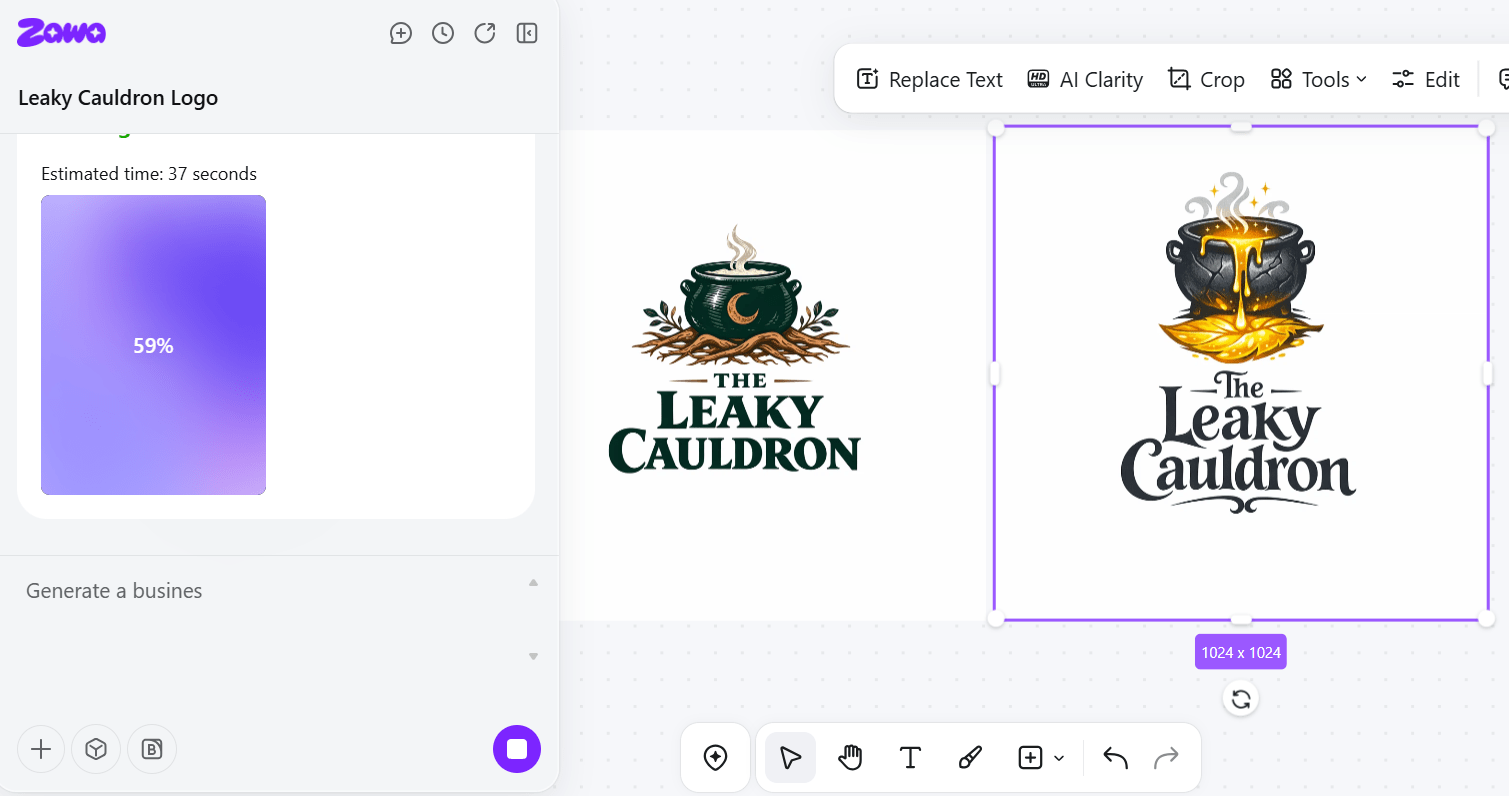
- Recognition: Does the mark remain identifiable as a small avatar or favicon?
- Readability: Is the business name legible on signage and packaging?
- Simplicity: Can it be reproduced in one color without fine details disappearing?
- Relevance: Does the idea connect to the brand position without relying on a generic industry symbol?
- Originality check: Have you searched for similar logos and relevant trademarks in the markets where the business operates?
- File quality: Can you obtain editable vector artwork, transparent raster exports, and color specifications?
AI generation can produce letterforms that look plausible but are malformed, and it may create symbols similar to existing work. Rebuild or clean the selected design in an appropriate vector editor and obtain qualified trademark advice where the brand investment warrants it.
Turn a logo into a usable visual system
A brand kit should define how to use the identity, not simply list colors and fonts. At minimum, record:
- primary and secondary logo versions;
- clear-space and minimum-size rules;
- one-color, reversed, and accessibility-safe variants;
- color values for print and screens;
- primary and fallback typefaces with license information;
- typographic hierarchy for headings, body copy, prices, and captions;
- photography or illustration direction;
- examples of incorrect logo use.
Check color contrast for text and interface elements rather than assuming that a generated palette is accessible. Also test characters, accents, currency symbols, and numerals in every language the business uses.
Apply the identity to real assets
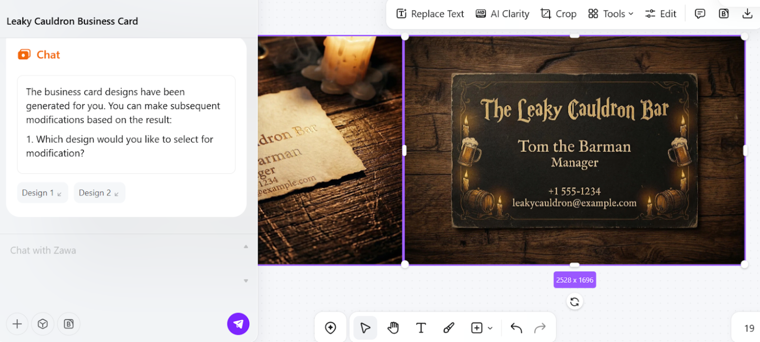
Once the core kit is approved, generate representative applications: a social post, menu, poster, package, and storefront mockup, for example. These reveal weaknesses that a logo page will not show.
- Replace all placeholder copy and verify names, prices, dates, contact details, and claims.
- Use the correct dimensions, bleed, safe area, and color mode for the output channel.
- Do not treat a mockup as print-ready artwork; inspect the actual exported file.
- Check that product photos accurately represent what is sold.
- Add alt text or a text alternative for important information in social graphics.
- Keep approved assets locked so later generations do not quietly alter the logo or colors.
Zawa can supply editable designs, but someone still needs to decide which content belongs, which hierarchy helps the reader, and whether the output meets the printer's or platform's technical requirements.
Where Zawa fits by business stage
New business
Use it to explore a few visual directions and create a provisional kit for testing. Finalize the name, domain, and trademark checks before investing in signage or packaging.
Existing small business
Begin with an audit of current assets. Preserve the elements customers already recognize and use Zawa to standardize inconsistent colors, templates, or social formats. A full redesign is not automatically better than a careful refresh.
Content creator
Prioritize a readable avatar, thumbnail system, caption style, and flexible post templates. The identity should support the content rather than add decoration to every frame.
Retail or hospitality brand
Test the system on menus, labels, signs, product photos, and promotional posters. Accuracy, legibility, local language support, and print reproduction matter more than an impressive mockup.
Limitations to consider
- Generated designs may resemble common templates or existing brand marks.
- Typography and small text can contain errors and must be replaced or proofread.
- A consistent visual style does not ensure a clear brand strategy.
- Image generation may misrepresent products, ingredients, people, or locations.
- Plan limits, export options, commercial terms, and available tools can change.
- Sensitive product photos, customer data, and unpublished campaign material require an appropriate privacy review before upload.
A practical approval checklist
- The selected concept matches a written positioning brief.
- The name and mark have been screened for confusingly similar uses.
- The logo works at small size, in one color, and on light and dark backgrounds.
- Fonts and images have appropriate licenses.
- Color contrast, language coverage, and text readability have been tested.
- Editable source files and export formats meet production needs.
- Every marketing asset has been proofread and checked against the actual offer.
- The brand kit documents rules that another person can follow consistently.
Zawa is most valuable when it shortens exploration and production while a person remains responsible for strategy, legal clearance, accessibility, and final quality.
Related Articles
 How to Change the Browser User Agent Without Extenstion6 minutes read
 How to Create a Personal Agent in n8n7 minutes read
 3 Essential Leadership Skills in the AI Agent Era6 minutes read
 How to Get a Talent Agent: Step-by-Step Guide15 minutes read
 How to Build an AI Agent with Gemini 3 in 10 Minutes13 minutes read
 Top 4 Best AI Agent Building Software5 minutes read
Reader Comments 0
Sign in with email or Google to join the discussion.