'Explore' design details on the Google logo
If you are a perfectionist then it's best not to look at the design details on the Google logo!
- 12 surprising facts about logos of world famous brands
- Score 50 logos of famous brands that day and now
- 14 strange images found on Google Maps make you confused
If you are a perfectionist then it's best not to "design" the design details on the Google logo!
Owning a simple and easy-to-use interface, Google is an extremely familiar tool for Internet users like we are today. However, if you are a perfectionist, perfectionist, it is best not to " look " at the design details on the Google logo, because they can make you extremely uncomfortable.
Internet perfectionists point out that the ' G ' in Google logo has a problem. It turns out that not only is the ' G ' problem but even the location where the mouse cursor appears on Chrome's search address bar has defects . Although Google's " G " logo was replaced two years ago, these " false " details have only recently surfaced on the Internet and people are asking questions about online decisions. Google.
However, in fact all have a reason and Google also has an explanation about this: " The Google logo was originally designed in a simple, friendly and accessible style. We want to keep re-characterize these features by combining the purity of geometry and the simple printing style of children's textbooks, the final perfect logo has been tested in many sizes and thicknesses. different to maximize accessibility in all circumstances ".
But is that enough to satisfy the perfectionists? Please read along to see the interesting images below!
Google's logo can make perfectionists feel extremely uncomfortable.
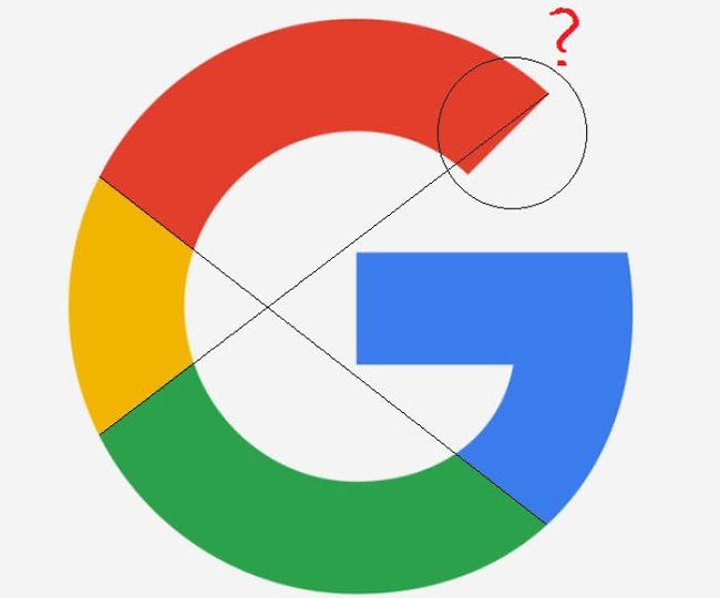
So immediately after that, someone stood out to fix it.

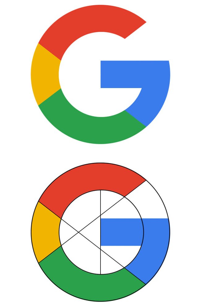
However, Google's " G " logo is also misleading in the circle.
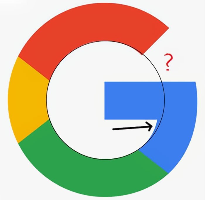
If "standard" must be like this!
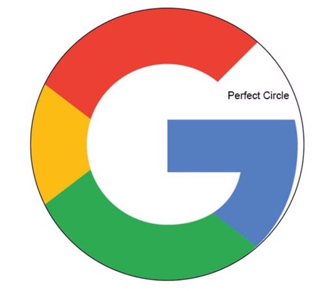
Even the thin thickness is disproportionate!
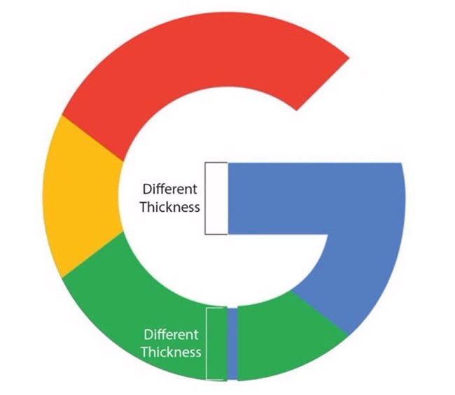
And there are other small errors that are hard to see!
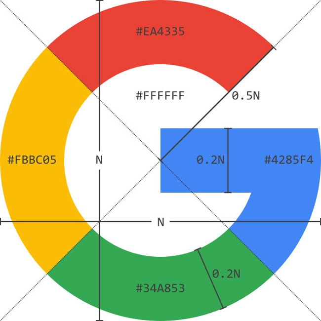
This is the " standard " that netizens offer. But what is the real reason behind them?
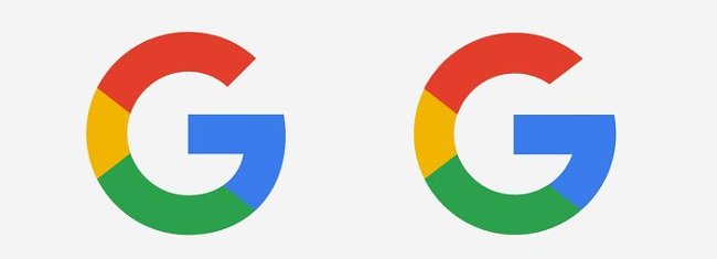
A " perfect " version for perfectionists. Google logo is designed in a simple, friendly and accessible style.
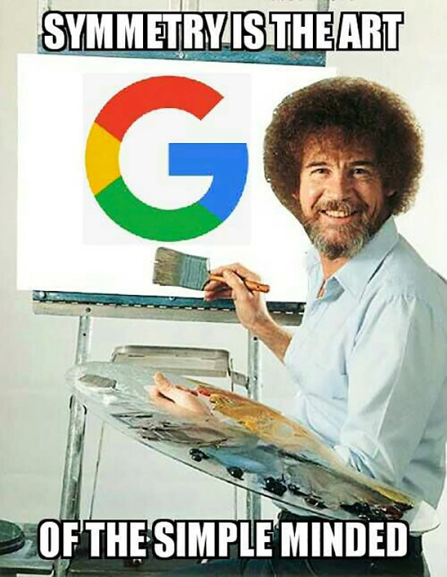
Symmetry is only art for those who are simple minds. " We want to retain these unique elements by combining the purity of geometry and the simple printing style on children's textbooks ." But is Google's explanation satisfied with you?
" The final complete logo has been tested with different sizes and thicknesses to maximize accessibility in all circumstances ."
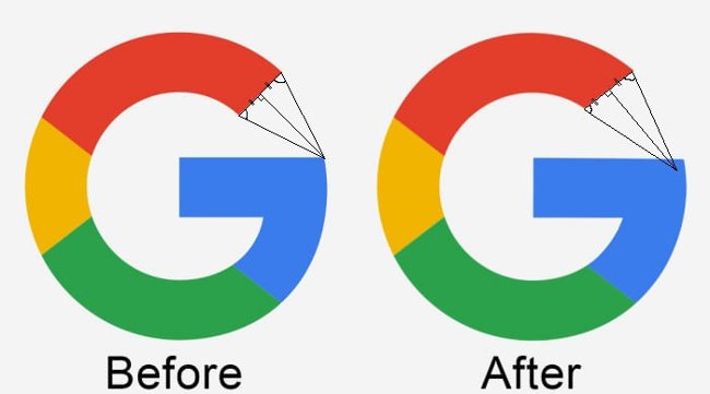
However, this explanation does not meet the requirements of the geometric full bridge. But what about you?
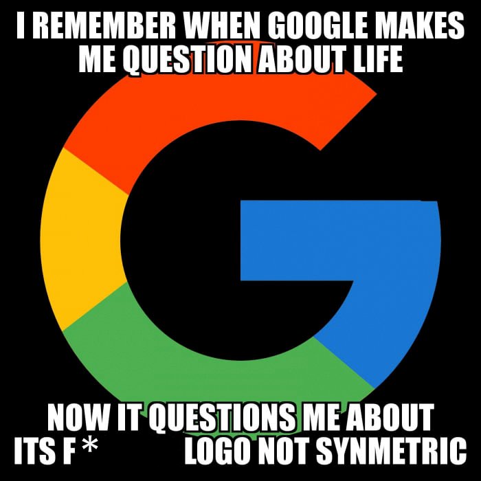
See also: 20 "tips" to use Google Search effectively but not everyone knows (Part 1)
Having fun!
- Using AAA Logo professional logo design
- Using DesignEvo to design online logo
- The 'evolutionary' history of the Google logo
- How to create a logo super fast and beautiful with professional Logo design software AAA Logo
- Firefox launched a new flat-design logo with 23 Beta version
- Microsoft explains the meaning of the Fluent Design logo templates that are about to be used on Windows 10


 How to change dots into commas on Google Sheets
  3 simple ways to download pronunciation files on Google Translate
  How to download videos Google Drive blocked download
  Fix GameLoop error without Google Installer
  How to fix Google Sheets not allowing scrolling
  How to use Google Drive like free FTP server or Network Drive