Table of Contents
This guide provides a clear overview of blueprint, including what Blueprint UI Toolkit is, Instructions for Using Blueprint UI Toolkit. Use it to understand the topic, compare the available options, and make a more informed decision.
What Is Blueprint UI Toolkit?
Blueprint UI Toolkit is a React UI component library. It contains a set of pre-made components that are easy to use & customize. You can use these pre-designed components right out of the box or modify them to fit each need.
Blueprint UI Toolkit components include Buttons, Forms, Modals, Navigation, & Tables. Using them can save you time and effort because you don't need to design and build each component from scratch.
Instructions for Using Blueprint UI Toolkit
To start using Blueprint UI Toolkit, you need to create a React app.
After setting up the project, you can install Blueprint UI Toolkit using any selected Node package installer. To install Blueprint UI Toolkit using npm, run the following command in the terminal:
npm install @blueprintjs/coreTo use yarn instead, run the following command:
yarn add @blueprintjs/coreOnce you've installed the Blueprint UI Toolkit, you can use select components in your React app.
Once you've installed the Blueprint UI Toolkit, you can use select components in your React app.
Using Components in Blueprint UI Toolkit
Before using this component, include the CSS file from the Blueprint UI Toolkit:
@import "normalize.css"; @import "@blueprintjs/core/lib/css/blueprint.css"; @import "@blueprintjs/icons/lib/css/blueprint-icons.css";Add the above code block to the CSS file that applies Blueprint UI styles to its element.
For example, to add a button to the application, use the Button from the Blueprint UI Toolkit:
import React from "react"; import { Button } from "@blueprintjs/core"; function App() { return ( ); } export default App;This block of code adds a button to the application with a Button . The Button component takes properties like intent , text , icon , small , and large.
The intent property defines the nature of the button, reflected in the background color. In this example, the button serves the purpose of making the background color green. Blueprint UI provides several core intents including basic (blue), success (green), warning (orange), and danger (red).
You can specify the text that appears inside the button using the text property. You can also add icons to the button using the icon property. Next to the icon is the rightIcon - add the icon to the right side of the button.
Finally, the large and small boolean properties specify the size of the button. The large property makes the node larger, while small makes the node smaller.
The initial block of code will create a button like this:

You can also use the AnchorButton component to create buttons in your application. The AnchorButton component is a specialized version of the Button component that is explicitly designed to be used as a link.
This component accepts many of the same properties as the Button component, including text , large , small , intent , icon. It also accepts href and target attributes.
The href attribute specifies the URL the button links to, and the target specifies the target window or frame for the link:
import React from "react"; import { AnchorButton } from "@blueprintjs/core"; function App() { return ( ); } export default App;The code block above renders an AnchorButton component. The element's href attribute value is 'https://example.com/' and the target value is '_blank', which means the link will open in a different browser tab or window.
Another essential component of Blueprint UI Toolkit is the Card . This is a reusable component that displays information in a visually appealing way.
The Card component has two properties interactive & elevation . The elevation property controls the shadow depth of the tag, with higher values creating a more prominent shadow effect.
The interactive property accepts a boolean value. When set to true, it allows hover and click interactions on the tag, allowing the tag to respond to user input.
For example:
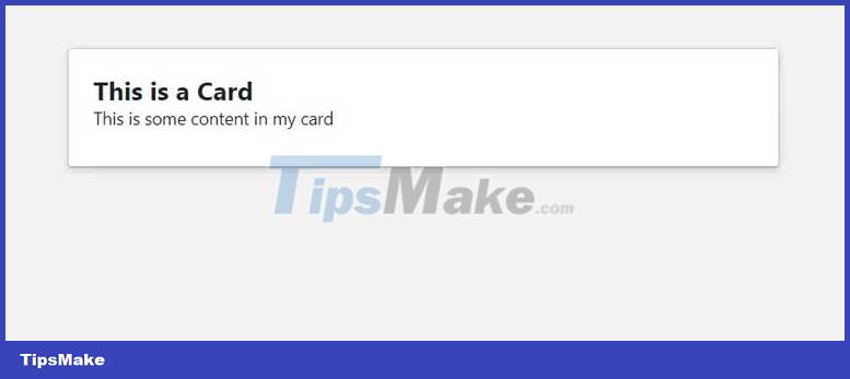
import React from "react"; import { Card, Elevation } from "@blueprintjs/core"; function App() { return (This Is a Card
This is some content in my card
); } export default App;In this example, the Card component has a title and some content. interactive is set to true.
You also import the Elevation component from @blueprintjs/core . Elevation is an enum that defines a set of predefined values that you can use to set the element's shadow depth.
The following are the available values of the Elevation menu:
- Elevation.ZERO : This value sets the shadow depth to 0, indicating the component doesn't have any shadows applied
- Elevation.ONE : This value sets the depth of the shadow to 1.
- Elevation.TWO : This value sets the depth of the shadow to 2.
- Elevation.THREE : This value sets the depth of the shadow to 3.
- Elevation.FOUR : This value sets the depth of the shadow to 4.
- Elevation.FIVE : This value sets the depth of the shadow to 5.
Rendering the code block above will display an image on your screen that looks like this:
Blueprint UI also provides many other components, such as Alert, Popover, toast, etc. However, with the information provided, you can build a simple React application using Blueprint UI.
Conclusion
Understanding Blueprint makes it easier to compare options, avoid common mistakes, and apply the information in this guide more effectively. Review the relevant requirements before making changes or choosing a solution.
FAQ
What is Blueprint?
This guide provides a clear overview of blueprint, including what Blueprint UI Toolkit is, Instructions for Using Blueprint UI Toolkit.
Why is Blueprint important?
Understanding Blueprint helps you evaluate features, compatibility, performance, and potential limitations before you choose a product or follow a procedure.
What should you consider when using or choosing Blueprint?
Consider your specific goal, compatibility requirements, available features, cost, security, and the practical recommendations described in this guide.
Related Articles
 How to Detect Clicks Outside a React Component Using a Custom Hook6 minutes read
 How to Manage State in React Using Jotai7 minutes read
 6 Best Free Tutorials to Learn About React and Create Web9 minutes read
 Best React Usages in 20236 minutes read
 How to Build a Login Screen with React and Bootstrap6 minutes read
 How to Create a Hacker News Clone Using React9 minutes read
Reader Comments 0
Sign in with email or Google to join the discussion.