5 types of simple job CV layout - beautiful is worth learning
The CV is the key to opening the first door for employers to pay attention to your profile. Even if you have many years of experience with excellent qualifications and skills but do not know how to express them scientifically and impressively, it is not difficult to get out right from the screening round.
The CV is the key to opening the first door for employers to pay attention to your profile. Even if you have many years of experience with excellent qualifications and skills but do not know how to express them scientifically and impressively, it is not difficult for you to be "out" from the screening round.
Here are 5 beautiful, simple CV layout that you can refer to. However, a small note is that the layout of the CV will vary depending on the goals, company culture, position you want to apply with a few other factors.
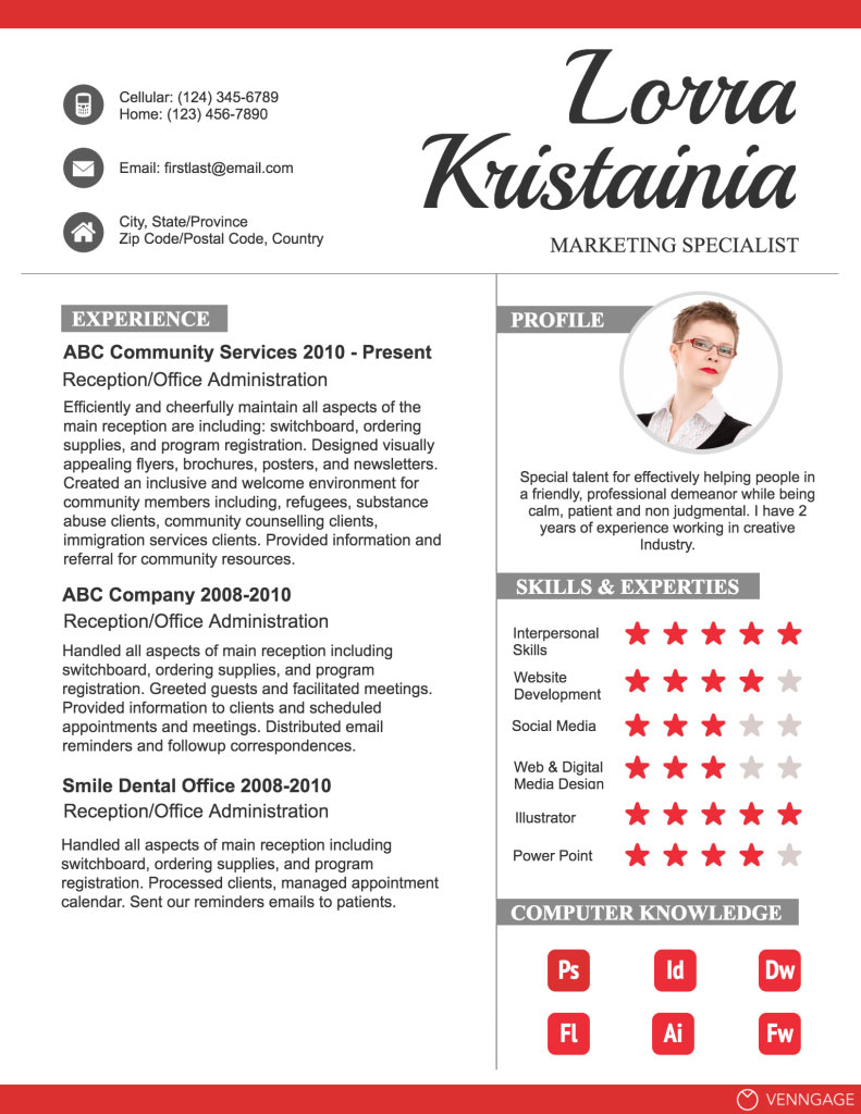
1. Classical layout
You might be worried about thinking about a CV with a slightly different design than usual. However, you can be more creative by combining tradition and modernity. For example, maintaining a simple layout can use symbols to replace verbal expression.

The CV above uses illustrations (Pictogram) for items such as skills, interests, social network accounts or you can also use for anything that can be replaced with an icon. In addition, creating accents for profiles with colors and fonts is also an interesting idea.
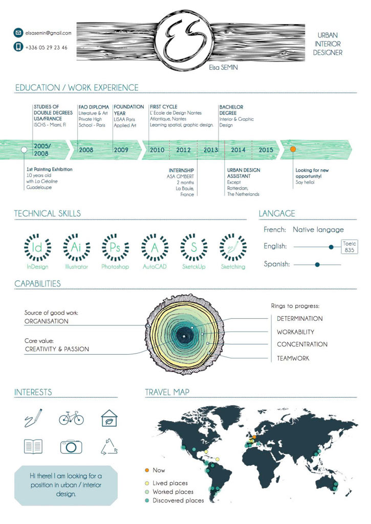
2. Timeline layout (timeline)
If you want to emphasize the timelines on your career journey, using the Timeline layout is an effective way. The simplest way to do this is to "map" the working experience in order from left to right or from top to bottom. As you can see in the CV below, the author still designed the traditional style but used the timeline to connect the items together, making the CV more creative than before.

To increase creativity, you can also remove some unnecessary items or arrange all the information on the timeline like CV of a Freelancer designer below.

3. Use personal photos that match the layout
Although the image should not be included in the CV (except the profile picture), you can fully exploit this element creatively to attract the attention of the employer.

One thing that is very noticeable is that most creative CVs are very professional. Therefore, instead of using old-style images, you can invest more in taking photos to have a better looking image; At the same time, it should be noted that the image must be placed in a position that is in harmony with the layout of the CV. If the CV is beautifully designed and the image is inadequate, your profile is not really perfect.
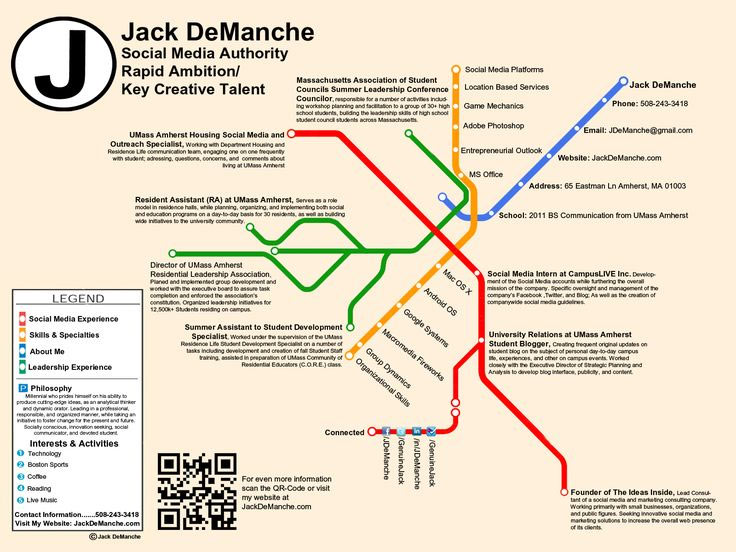
4. Layout in map form
If you have worked at many different locations, creating a CV layout as a map is an effective way to visualize your work experience.

In addition, you can also connect information using performance lines, however, be careful because it can make your CV complicated and confusing.

5. Layout in the form of a graph
Using a chart in a CV is a good way if you have taken a position to help significantly increase revenue for the old company in several stages. Other items such as skills or education can also be described with appropriate charts.

Note that if you choose the wrong type of chart, it can make the employer misunderstand the idea you want to express.
Discover more
Job CV resume CV writing CV design CV layoutShare by
Jessica TannerYou should read it
- Design Layout - Website layout in CSS
- To have an impressive English CV you should not give the following words
- 8 mistakes when writing a CV that put you at risk of long-term unemployment
- Website design tutorial in Photoshop (Part 3): Create professional website layout
- 50 beautiful CV templates, personality to help you score with employers
- The Quiet Details That Make a Sports Betting Platform Feel Reliable
- Instructions on creating toy set images with ChatGPT AI
- How are AI agents changing the journalism industry?
- These are the 6 types of people who are easily 'hated' but also most loved at work
- Top 10 types of employees at highest risk of dismissal
- How to become a millionaire on Instagram?