The reason technology companies often choose blue logos
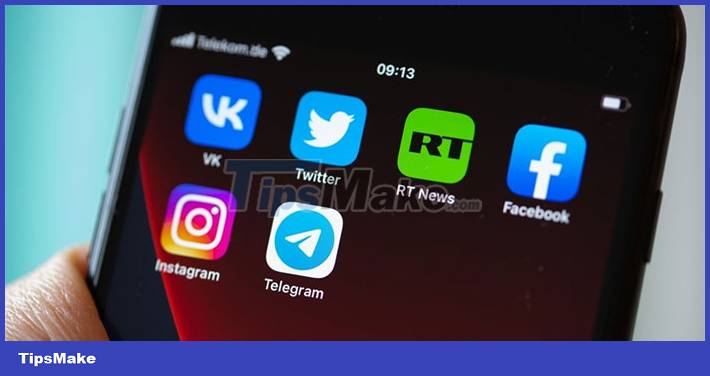
Have you noticed that the logos of most tech companies are usually blue like Facebook, LinkedIn, Skype and Telegram…? According to experts, this is all related to the psychology of the user's psychology.
Table of Contents
Black and blue dominate 53% of logos in the tech industry
According to new research by printing company Solopress, 53% of all the world's best performing tech brand logos are black and blue. Of which, blue is used by 30% of the best performing technology companies and is often used for social networking applications.
As explained by experts, the color blue creates a sense of security and comfort for the viewer, and at the same time shows loyalty and professionalism. The color blue also helps us to calm down and lower the heart rate. Also, small changes to the exact shade of blue can make a difference.
Neuromarketing expert, Katie Hart shared, Google changed the specific shade of blue when it switched to a more 'red' blue for its links. Most users don't realize this change, but it adds up to $200 million in advertising revenue each year for the company.
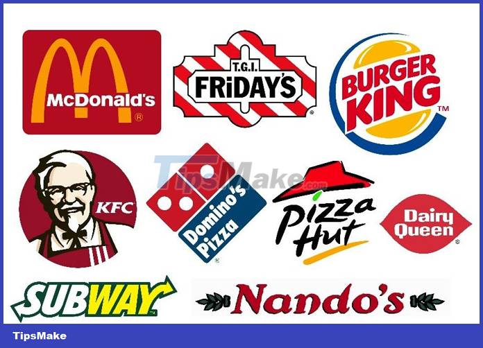
Red and pink colors dominate food and beverage industry logos
41% of logos in the food industry and 29% of logos in the beverage industry are red and pink.
The longer wavelength red has a stimulating effect on the receiver, arousing and motivating us to take action.
To some extent, red increases heart rate, blood pressure and cravings making us act faster, more impulsively, and likely to eat more. Therefore, red and pink colors are commonly used in the food and beverage industry, especially in fast food chains.
Was this article helpful?
Your feedback helps us improve.
Related Articles
 Thousands of Windows computers encountered the 'blue screen of death' error, the airline was paralyzed2 minutes read
 What is the common symbol for AI?2 minutes read
 It turns out this is the reason why seawater is often blue but the waves are white3 minutes read
 Top 14 technology companies all want to start5 minutes read
 An interesting source of names for big technology companies7 minutes read
 Microsoft tops the list of the world's top 100 technology companies2 minutes read
Reader Comments 0
Sign in with email or Google to join the discussion.