How to build web components using Stencil.js
Stencil.js is a compiler that generates web components compatible with all modern browsers. Stencil.js provides tools and APIs that help you build fast, efficient, and scalable web components..
Stencil.js is a compiler that generates web components compatible with all modern browsers. Stencil.js provides tools and APIs that help you build fast, efficient, and scalable web components.

Stencil.js User Manual
First, you need to launch it on your computer. Do this by running the following command in the node.js terminal:
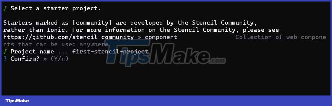
npm init stencilAfter running this command, a prompt will appear on the screen for you to choose the project you want to start:
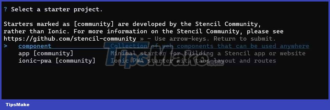
To continue, click the component selection, enter the name of the project and confirm the selection:
Next, change the directory of the project and install the dependencies by running the following commands:
cd first-stencil-project npm installCreate a new web component
To create a new web component in Stencil.js, create a directory path like src/components. This components directory will contain a TypeScript file named after your element, because Stencil.js uses TypeScript and JSX to develop the component. This folder also contains a CSS file that contains the element's style.
For example, if you want to build a component named my-button, create a file named my-button.tsx and a CSS file named my-button.css. In the file my-button.tsx , define the element using the Stencil.js API:
import { Component, h } from '@stencil/core'; @Component({ tag: 'my-button', styleUrl: 'my-button.css', shadow: true, }) export class MyButton { render() { return ( ); } }This code imports Component and h from Stencil.js. The Component function identifies the element, and the h function creates its markup in HTML.
Define the component with @Component , which takes an object with 3 properties: tag , styleUrl , and shadow .
The tag attribute contains the tag name of the element. The styleUrl property defines the CSS file to style the custom element. Finally, the shadow property is a boolean, indicating whether the element will use the Shadow DOM to encapsulate the element's styles & operations. In the render method, create a button.
In addition to the styleUrl property , you can use more properties to style elements: style and styleUrls .
The style attribute defines the inline style for this element. It takes a string value representing the element's CSS style:
import { Component, h } from '@stencil/core'; @Component({ tag: 'my-button', style: ` button { padding: 1rem 0.5rem; border-radius: 12px; font-family: cursive; border: none; color: #e2e2e2; background-color: #333333; font-weight: bold; } `, shadow: true, }) export class MyButton { render() { return ( ); } }
The styleUrls property defines multiple files outside of the CSS for styling the element. It takes an array of string values representing the paths to the CSS file:
import { Component, h } from '@stencil/core'; @Component({ tag: 'my-button', styleUrls: ['my-button.css', 'another-button.css'], shadow: true, }) export class MyButton { render() { return ( ); } }Export web components
Once you've created the web element, you can export it to an HTML file by adding a custom element tag. Here's how you can include the my-button component:
Stencil Component Starter Overall, Stencil.js is a powerful, fast and efficient tool for creating web components. Hope the article helps you better understand how to use Stencil.js.
 Samuel Daniel