Difference between RGB, CMYK and Pantone
As a digital designer or illustrator, you may have heard of RGB, CMYK and Pantone, but do you know what they mean?.
As a digital designer or illustrator, you may have heard of RGB, CMYK and Pantone, but do you know what they mean? It's important to use the correct color profile for your digital designs to get the best consistent quality in your results.
What is color profile?

A color profile or color mode is the type of color your digital art document uses. The general color modes are CMYK, RGB, and Pantone, but there are more specialized color modes within them.
Different software or devices sometimes have specific color modes. For example, Procreate has a wide selection of color profiles as well as some specific RGB profiles that are unique to Apple. You can also use different color profiles depending on the area where you are printing the design.
Colors are not always the same on all screens. Different color profiles are used when you print a design, create a screen-based design, or professionally print large-scale designs for multiple runs.
If you're creating digital or printed artwork, you should learn about color profiles and when to use them correctly. This ensures your results are always accurate, consistent and of the best quality possible.
What is CMYK?
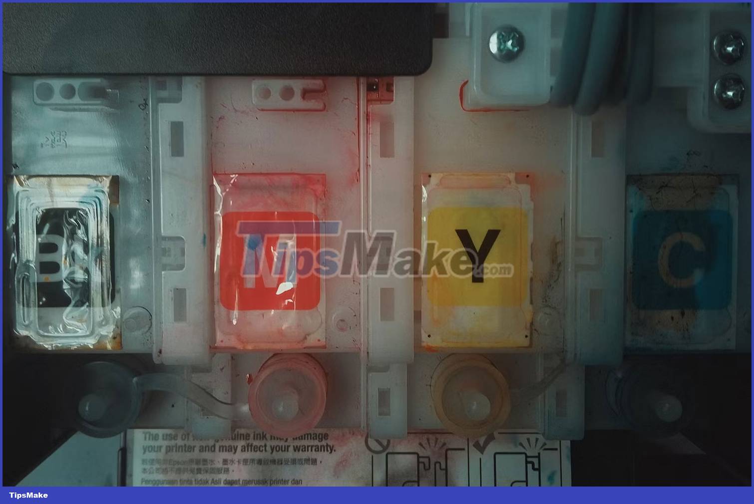
CMYK is a print-based color profile, short for 4 colors: Cyan, Magenta, Yellow and black (called Key in the design industry). By mixing these 4 colors, all other colors can be created in printing.
CMYK is also known as 4-color process because 4 printing plates are used in the printing process. CMYK will add color layer by layer through the halftone technique to create full-color prints.
When should I use CMYK?

If your intention is to print, you should always create your documents in the CMYK profile. For example, if you're creating a brand or logo style guide, you should provide CMYK color variations along with RGB and Pantone, if possible.
Converting documents from RGB to CMYK is much easier, and many online printers do this - such as when printing from Canva's print shop. But if you decide from the start that you're going to print the design, it's best to create the document in CMYK mode instead of converting it later, as that doesn't yield perfect results.
CMYK colors are often more limited than RGB. This is due to the additive nature of CMYK printing and its lack of bright color reproduction. To achieve brighter print colors, you should use Pantone colors.
What is RGB?

RGB is a color profile used for digital or on-screen artwork and images and it stands for Red, Green and Blue. It uses a light quenching process to create color, resulting in a much larger color range than CMYK.
The more light used, the brighter the color, and the less light used, the darker the color - that's how black is created in RGB, with absolutely no light.
RGB colors have reducing properties. This means that the more color - or light - you use, the lighter or whiter they appear. The less color - or light - used, the darker they appear. Similar to turning on or off a light.
When should you use RGB?

RGB color profiles should be used for all digital designs for displays. This includes animations and videos, social media posts, logo variations, character portraits, and anything else that can be viewed on a screen or device.
Of course, sometimes you may want to print something after having done it using RGB color mode. In this case, it's much easier to create in RGB mode and convert your document to CMYK for printing than the other way around.
When converting RGB to CMYK, because the RGB profile produces a larger color gamut, the CMYK equivalent will often be more limited than the original RGB document. This note is important, especially if color is an integral part of your design.
What is Pantone?
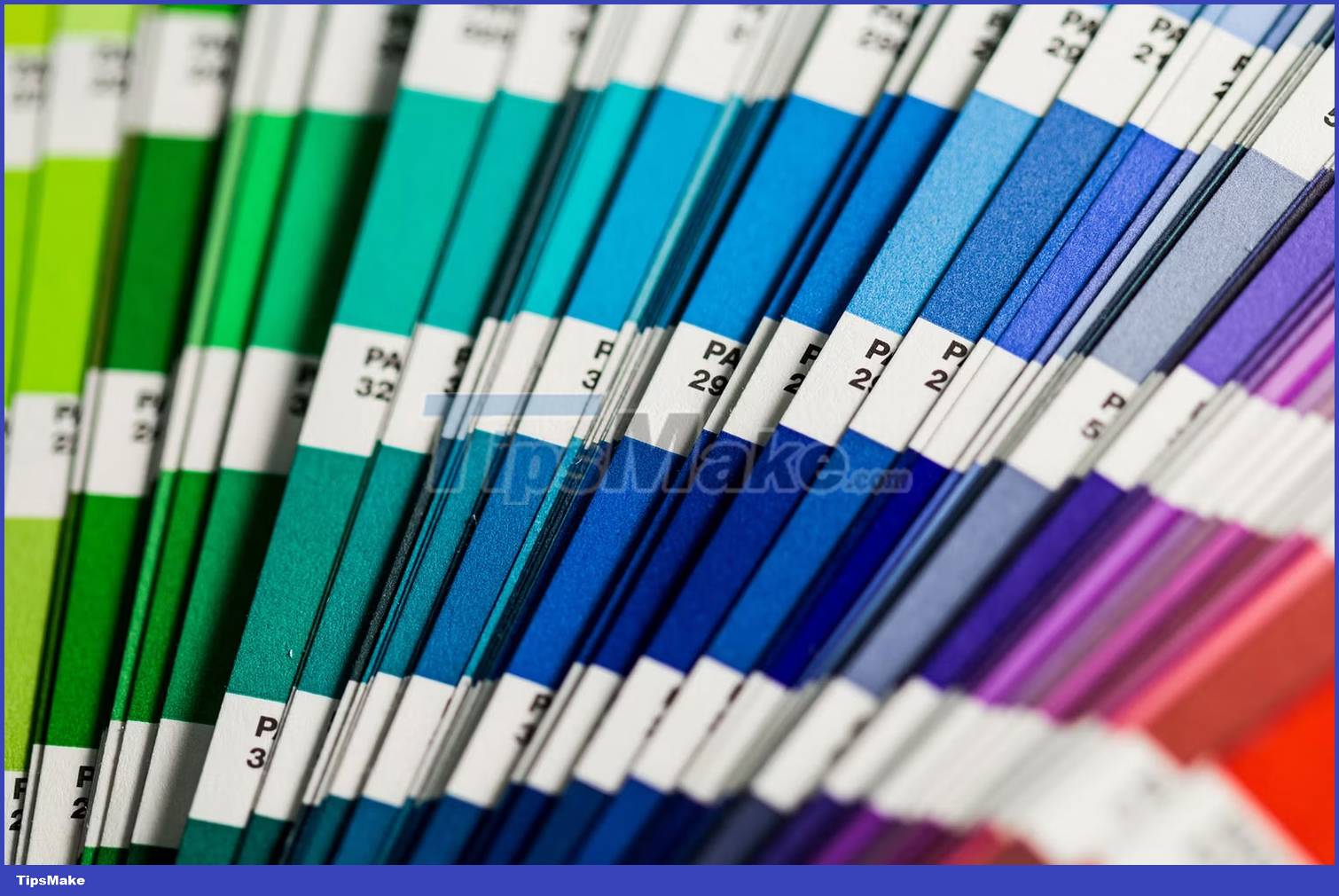
Pantone colors are not exactly a color profile that you can choose to create a document but are an overall color consistency. Also known as PMS - Pantone Matching System - Pantone is a color range you can use for your art materials and print designs using color swatches.
As you may know, Pantone is one of the world's leading color companies. Typically, Pantone specializes in paint, but in the design world, Pantone colors are also the global benchmark for consistency.
When should I use Pantone?
If you're a designer, illustrator, or digital artist, you may not need to use Pantone colors. But if you're designing and printing color-matched items on a large scale - especially for globally recognized brands - Pantone will be your best bet for getting key colors. body.
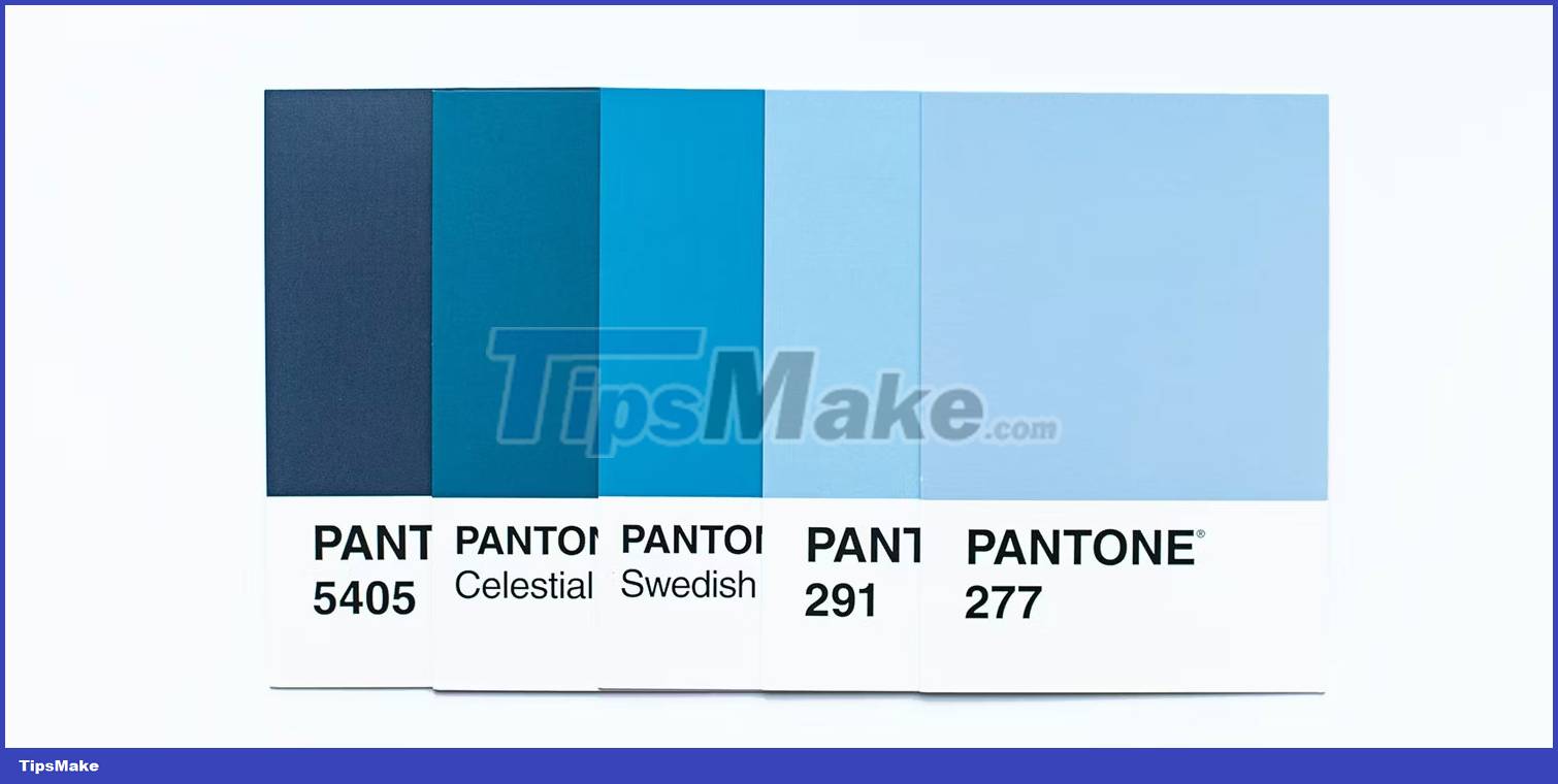
Adobe Creative Cloud used to keep the Pantone color palette in its programs, but it was removed in 2022. You have to pay for a Pantone booklet if you want to use consistent colors across major brands . Color booklets provide printed templates with titles and numbers.
Pantone colors can be used to create specialty colors such as neon and metallic colors that cannot be printed using the conventional 4-color process. You can also use the Pantone Studio app to create color palettes.
Using the Pantone color system, you're guaranteed to get the exact colors you need for the job, regardless of how your monitor is calibrated or where the printing takes place. However, you should always calibrate your monitor for accurate colors to avoid disappointment when printing from an uncalibrated monitor.
For the most part, the Pantone matching system is used by brands with accurate and iconic colors, such as Amazon or UPS, where the brand can be recognized worldwide and, therefore, recognized. printed in different countries or by different manufacturers. PMS color provides accurate color across the board, regardless of who designs and prints.