Lesson 2: Learn about Containers in Bootstrap 5
Containers in Bootstrap are important when programming. Here's everything you need to know about containers in Bootstrap 5.
Table of Contents
Containers in Bootstrap are important when programming. Here's everything you need to know about containers in Bootstrap 5 .
What are Containers in Bootstrap?
In Bootstrap, containers are used to set margins for content. It contains row elements and the row element is the column's container. This is called a grid system. You have two container classes in Bootstrap, including:
- .container
- .container-fluid
The theory is like that, it's easiest to imagine, in more simple terms, Container creates a box containing other elements inside. This box has a width set according to the size of the display screen.
The table below illustrates how each container's max-width changes with each breakpoint.
For example, when using the .container class, the actual width of the container will be 100% if the viewport width is <576px, 540px if the viewport width is ≥576px but less than <768px, 720px if the viewport width is ≥ 768px but <992px, 960px if viewport width is ≥992px but <1200px, 1140px if viewport width is ≥1200px but <1400px, and 1320px if width is ≥1400px.
Similarly when using class .container-lg, the actual width of the container will be 100% until the viewport width is <992px, 960px if the viewport width is ≥992px but <1200px, 1140px if the viewport width is ≥1200px but <1400px, and 1320px if viewport width ≥1400px.
| Bootsrap's grid system | X-Small
<576px |
Small
≥576px |
Medium
≥768px |
Large
≥992px |
X-Large
≥1200px |
XX-Large
≥1400px |
.container |
100% | 540px | 720px | 960px | 1140px | 1320px |
.container-sm |
100% | 540px | 720px | 960px | 1140px | 1320px |
.container-md |
100% | 100% | 720px | 960px | 1140px | 1320px |
.container-lg |
100% | 100% | 100% | 960px | 1140px | 1320px |
.container-xl |
100% | 100% | 100% | 100% | 1140px | 1320px |
.container-xxl |
100% | 100% | 100% | 100% | 100% | 1320px |
.container-fluid |
100% | 100% | 100% | 100% | 100% | 100% |
In this article, QuanTriMang will provide more detailed instructions on how to use containers and accompanying components in Bootstrap 5. Bootstrap 5 has 2 container classes for you to choose and use:
- Class
.containerprovides a responsive fixed-width container.

- Class
.container-fluidprovides a full-width container that spans the entire width of the viewport.
Learn about 2 types of Containers in Bootstrap 5
Fixed container
Use class .containerto create a responsive, fixed-width container.
Note that its width (max-width) will change on different screen sizes:
| Screen size | max-width |
| Extra Small <576px | 100% |
| Small ≥576px | 540px |
| Medium ≥768px | 720px |
| Large ≥992px | 960px |
| Extra Large ≥1200px | 1140px |
| XXL ≥1400px | 1320px |
XXL (≥1400px) is new in Bootstrap 5. On Bootstrap 4, only Extra large (≥1200px) is supported.
For example , try using the following code, save it to an HTML file and try opening it in a browser window. Then adjust the window size to see the change!
Ví dụ Bootstrap QuanTriMang's first Bootstrap page
You can learn Bootstrap 5 and other programming software on QuanTriMang
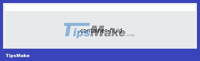
Large container
Use class .container-fluidto create full width container with screen width (width is always 100%)
For example:
QuanTriMang's first Bootstrap page
You can learn Bootstrap 5 and other programming software on QuanTriMang
Additional components for the Container
Container padding intervals
By default, containers have left and right padding, no top/bottom padding. Therefore, we often need to use additional spacing facilities, such as additional padding and margins , to make them look better. For example, .pt-5it means " padding top ". For example:
Border and color of Container
Other widgets, such as borders and colors, are also commonly used in conjunction with Containers.
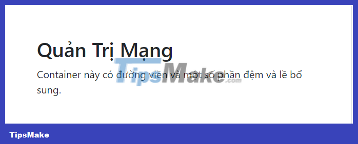
Example 1:
TipsMake.com
This container has a border and some additional padding and margins.
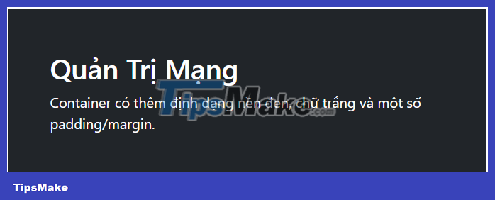
Example 2:
TipsMake.com
The container has additional formatting of black background, white text and some padding/margin.
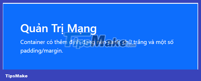
Example 3:
TipsMake.com
The container has additional formatting of a blue background, white text and some padding/margin.
You'll learn more about colors and border widgets in later articles!
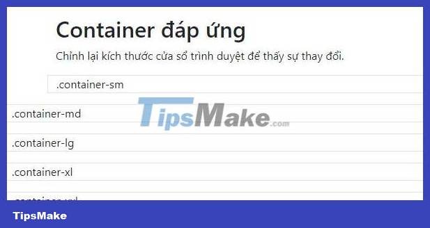
Responsive Containers
You can also use classes .container-sm | md | lg | xlto determine when the container will be responsive.
max-widthof the container will change on different screen/viewport sizes:
| Class | Extra small <576px |
Small ≥576px |
Medium ≥768px |
Large ≥992px |
Extra large ≥1200px |
XXL ≥1400px |
|---|---|---|---|---|---|---|
| .container-sm | 100% | 540px | 720px | 960px | 1140px | 1320px |
| .container-md | 100% | 100% | 720px | 960px | 1140px | 1320px |
| .container-lg | 100% | 100% | 100% | 960px | 1140px | 1320px |
| .container-xl | 100% | 100% | 100% | 100% | 1140px | 1320px |
| .container-xxl | 100% | 100% | 100% | 100% | 100% | 1320px |
For example:
.container-sm .container-md .container-lg .container-xl .container-xxlExample on website TipsMake.com.com:
Bootstrap Example Containers meet
Resize the browser window to see the change.
.container-sm .container-md .container-lg .container-xl .container-xxl
As mentioned above, Bootstrap creates a series of predefined container classes to help you build the web layout you want. You can customize the predefined container classes by editing the Sass map (found in _variables.scss) owns them:
$container-max-widths: ( sm: 540px, md: 720px, lg: 960px, xl: 1140px, xxl: 1320px );In addition to customizing Sass, you can also create your own containers by combining Sass like the example below:
// Source mixin @mixin make-container($padding-x: $container-padding-x) { width: 100%; padding-right: $padding-x; padding-left: $padding-x; margin-right: auto; margin-left: auto; } // Usage .custom-container { @include make-container(); }Above is good information on how to create basic containers using Bootstrap 5. Hope the article is useful to you.
Was this article helpful?
Your feedback helps us improve.
Related Articles
 Lesson 1: What is Bootstrap 5? How to get started?9 minutes read
 Lesson 42: Large Grid in Bootstrap 56 minutes read
 Lesson 41: Grid Medium in Bootstrap 57 minutes read
 Lesson 38: Grid Systems from Stacked to Horizontal in Bootstrap 53 minutes read
 Lesson 30: Flexing in Bootstrap 513 minutes read
 Lesson 40: Small Grid in Bootstrap 59 minutes read
Reader Comments 0
Sign in with email or Google to join the discussion.