What you will learn
- Define the question a chart must answer.
- Select a clean data range with meaningful labels.
- Choose a chart type that matches comparison or trend.
- Write a summary that separates observation from explanation.
What you need
- An Excel table with at least one category and numeric measure.
- Basic ability to sort or summarize data.
Chart type should follow the analytical question
Microsoft provides chart creation tools and recommended charts based on selected data.
Microsoft notes that data arrangement affects which chart can be created and how categories and series are interpreted.
Use bars for category comparison, lines for ordered time trends and scatter plots for relationships between two numeric variables. Pie charts make precise comparison difficult and become cluttered with many categories. The title should state the measure and scope, not merely “Chart 1.”
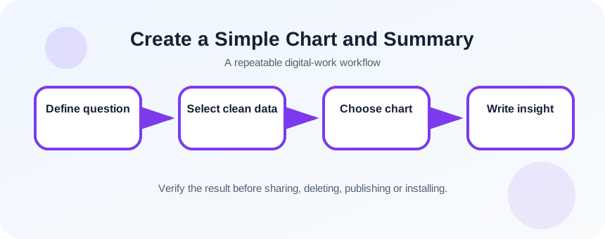
Build a chart-ready summary
Do not chart a raw operational table if the question requires totals by category. Create a small summary area or PivotTable with one row per category or time period. Include units and confirm whether values are counts, percentages, averages or totals.
- 1
Write the question in one sentence.
- 2
Choose the measure and unit.
- 3
Define the category or time axis.
- 4
Create a summary table.
- 5
Check totals against the source.
- 6
Remove blank or subtotal rows from the chart range.
Create and label the chart
Select the summary table, insert the intended chart and inspect how Excel assigned series and category labels. Switch row and column only when it matches the question. Add a specific title, axis labels where needed and direct data labels only when they improve interpretation.
- 1
Select the summary range.
- 2
Insert a recommended or chosen chart.
- 3
Confirm categories and series.
- 4
Add a descriptive title.
- 5
Label units.
- 6
Remove unnecessary legend or gridlines.
- 7
Check the axis scale and category order.
Write an evidence-based summary
Begin with what the chart directly shows: the highest category, direction of change or approximate difference. Then state limitations such as missing periods, small sample or unadjusted values. Explanations for why the pattern exists require additional evidence and should be labeled as hypotheses.
Test dynamic behavior by changing one source value or adding a row. If the chart does not update, the source range may be fixed or the summary may need refresh. Record the data date in the title or caption for recurring reports.
- 1
Write one observation sentence.
- 2
Add one comparison with units.
- 3
State one limitation.
- 4
Separate any causal explanation as a hypothesis.
- 5
Change a test value and confirm chart update.
Test independent understanding
Show the chart without the surrounding worksheet and ask a reviewer what it measures, over what period and what conclusion is justified. If they cannot answer from the title, labels and caption, the chart depends too heavily on hidden context.
- The chart answers the original question.
- Labels identify measure, units and scope.
- The written summary does not claim more than the data shows.
Create a category comparison chart
Summarize a small dataset and communicate one defensible insight.
- 1
Choose a clean table.
- 2
Define a category comparison question.
- 3
Create a summary table.
- 4
Insert a bar chart.
- 5
Add labels and a dated title.
- 6
Write one observation, one limitation and one next question.
Common mistakes to avoid
- Selecting raw data with unrelated columns.
- Using a chart type that does not match the question.
- Truncating the axis to exaggerate differences.
- Writing causal explanations without evidence.
Key takeaways
- Charts are visual arguments.
- Prepare and validate a summary table first.
- Observation, limitation and explanation should be separated.
Frequently asked questions
Which chart should a beginner use most often?
Bar charts are effective for category comparison, and line charts are useful for ordered time trends. Choose based on the question.
Why did Excel create several unexpected series?
The selected range or orientation may be wrong. Inspect headers, remove totals and use Select Data or Switch Row/Column carefully.
Sources and further reading
- Create a chart from start to finishMicrosoft Support
- Select data for a chartMicrosoft Support
Ready to continue?
Mark the lesson complete so your Learning Path progress stays current on this device.