Google has changed the interface and display on the search page, making users very uncomfortable
Google search page has changed the interface and display of results, adding icons of search results sites, and the link is placed above the title.
Google search page has changed the interface and display of results, adding icons of search results sites, and the link is placed above the title. The purpose of this change is to help Google users know where that information comes from, whether it is fake or trusted. Previously, Google had similar changes on the mobile search page.
The first thing that catches attention of users when looking at the new interface on Google search is the website logos and links because they stand out at the top. Next is the article's title with a larger font size.

However, according to user reviews, this change on the Google search page does not improve the user experience, but also confusing and distracting. It is not as simple and neat as the previous interface.
It is a fact that, compared to the icons or see where the news source comes from, users are still more interested in the search results and whether the titles match the content they search.

How would you rate the new Google change, do you like the way this icon and link appears? Leave your comments in the comments at the end of the article.
- Desktop Mode simulation application of Android 10 has been released on Google Play
- Google can completely ban your account, please protect yourself before it's too late
Was this article helpful?
Your feedback helps us improve.
Related Articles
 The Google search page is flooded with ads3 minutes read
 The Google home page on mobile has changed, no longer just a search engine, but also many other interesting things2 minutes read
 Google changes the search engine, gives a unique answer and hides unnecessary links in some cases2 minutes read
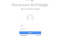 Google changed the look of the new Gmail login page1 minutes read
 6 ways to search by date on Google you may not know9 minutes read
 Google improves Search to provide more in-depth results for questions2 minutes read
Reader Comments 0
Sign in with email or Google to join the discussion.