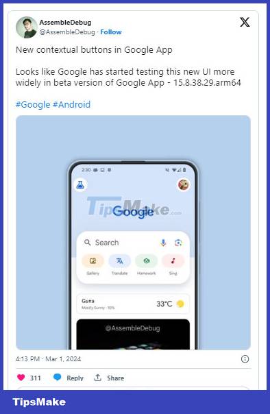
The new Google Search buttons have appeared in beta for some people
While the Google Search app has yet to be updated to comply with the Material You colors, introduced with Android 12, the company behind the search engine is busy with another interface update for the app its core.
As discovered by AssembleDebug, some beta testers are now seeing a new homepage design with an improved search bar and colorful quick action buttons.
This new design is a departure from Google's usual monochrome approach to apps, largely riding on the popularity of the wallpaper-based Material You design from its apps. The general layout of the Google home screen remains the same, but the top section features the Google logo and the search bar had a bright blue background in testing. The search bar itself is also taller, making space for four colorful new buttons below the familiar invitation to start searching: Gallery, Translate, Homework and Sing.
AssembleDebug hasn't shared what happens when you tap the buttons, and it's unclear whether they're fully functional in this early stage. It's clear that they could just be a redesign of the existing buttons below the search bar, with a colorful background that attracts more attention than the old gray one.

In the current version of the Google app, buttons with similar names lead to Google Lens, which pulls up the corresponding dedicated filter to better find the information you're trying to get from the image. The exceptions here are 'Identify songs', which brings up a dedicated listening section on Google, and a 'Shop for products' button that lets you search for things to buy in your screenshots. Interestingly, the second option is not found in the redesign.
The new interface also puts redesigned buttons front and center. Although the current design offers five options, you need to scroll left and right to access all of them. Since there is no visual indication that this is possible, many people may not even use the additional buttons.

This new design appears to be rolling out to some participants in the Google apps beta program, version 15.8.38.29.arm64.
Like any experiment, it's possible that Google could suddenly pull it completely or change it to something else. Surely this could be a glimpse into some form of post-Material You design strategy. After all, the GoogleSearch app is one of the few actively developed Google apps that still lacks Material Design 3 and its vibrant colors.
Discover more
Share by
Jessica TannerYou should read it
- How to add Google Search options on Microsoft Edge
- Interesting search engines on Google that you may not know yet
- Google improves Search to provide more in-depth results for questions
- Google announced a major change in search functionality
- Google Search Android encounters strange errors, automatically escaping when users search for these keyword phrases
- The Quiet Details That Make a Sports Betting Platform Feel Reliable
- Instructions on creating toy set images with ChatGPT AI
- How are AI agents changing the journalism industry?
- How to add Admin to WhatsApp channel
- Latest Second Piece code and how to enter code
- What is the difference between Apple Vision Pro and Meta Quest 3? Which one should I buy?